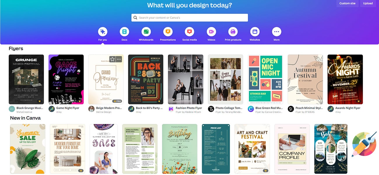
Here at CodeDesign, we love to try new design tools. Written by one of our staff who has never used Canva before, we’ll go through the process of navigating Canva’s home page, choosing a project and template from a mind bogglingly large array of options, and work our way to a finished product.
This article is meant to inform and inspire. If you need it, please use this as permission to go poke around, even if you don’t feel like an artistic person or have anything specific in mind to create. Canva provides a hugely expansive website chock full of content, project ideas, templates, elements, and so much more, and it’s ridiculously easy to get lost in.
What is Canva?
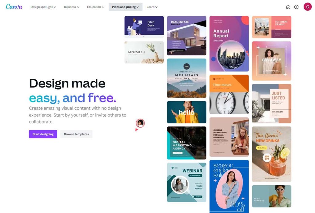
Canva is a beginner-friendly, drag and drop graphic design platform that allows users to create graphics for a range media, from social media posts and photo collages to business cards, book covers and even email marketing material. It also has a vast library of images, fonts, graphics, layouts and more. It also has a vast library of images, fonts, graphics, layouts and more.
There are, of course, lots of features I didn’t explore in this article, including the video editor, the much lauded but premium only magic resize tool, logos, absolutely anything to do with a brand kit, and plenty of others.
Canva Free vs Canva Pro
Canva has both a free version and a paid version, with differing features.
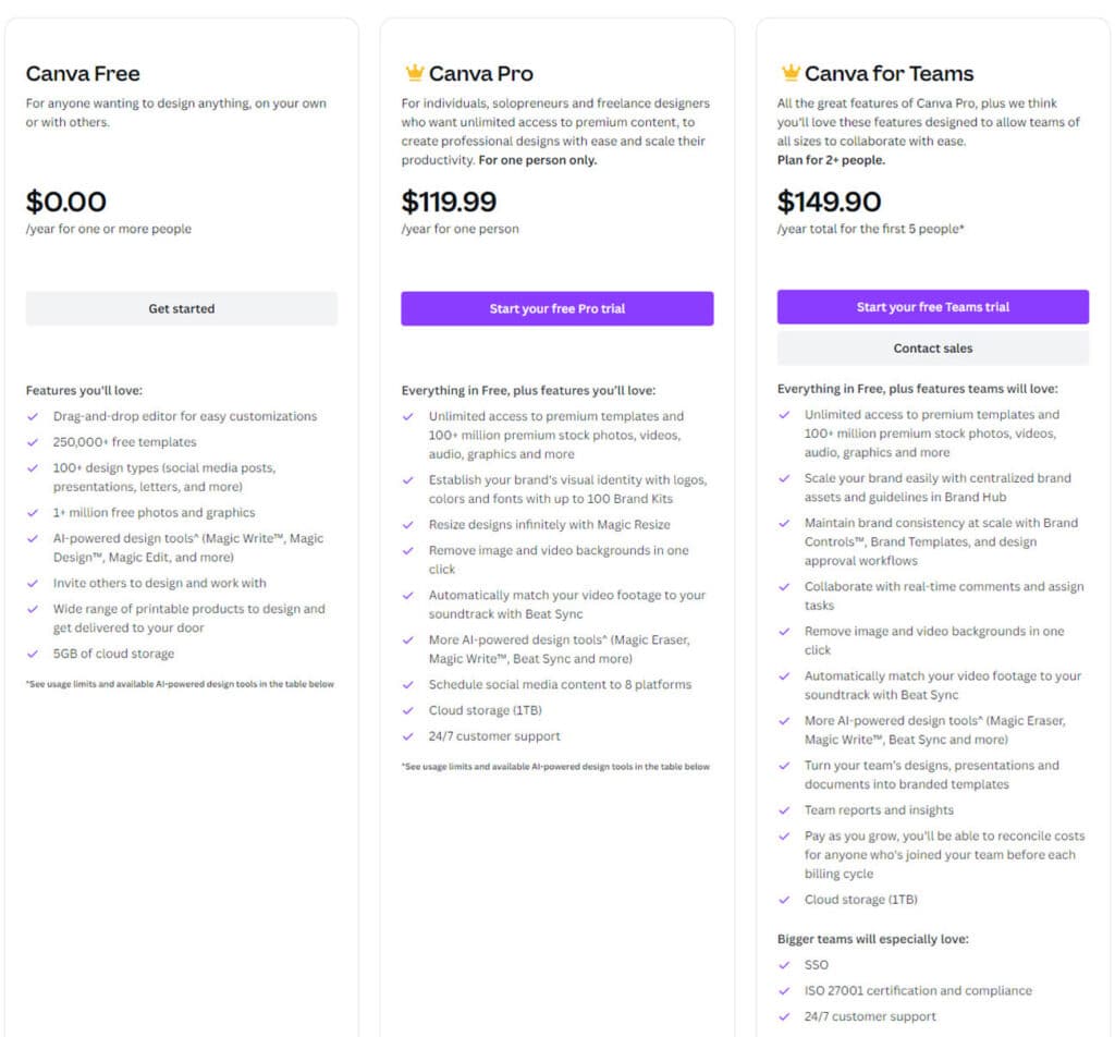
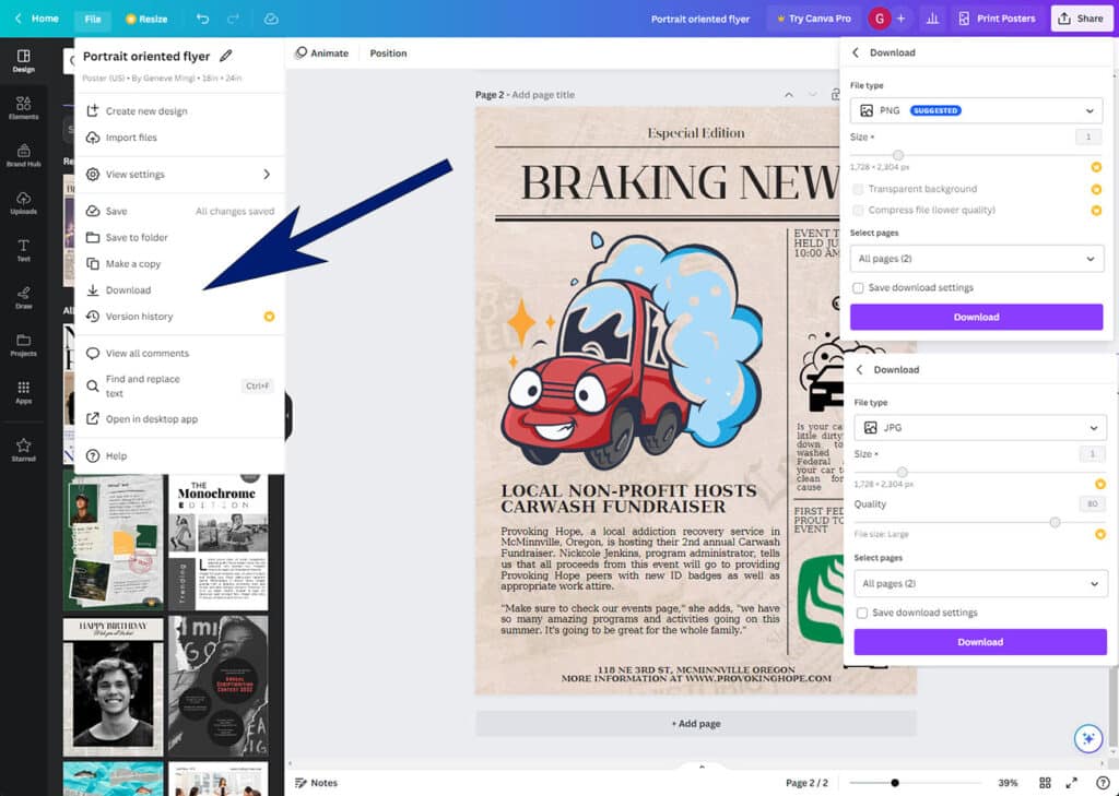
Looking through the options, I didn’t see anything that I felt like I couldn’t live without, and for the most part that was true. The only real surprise came at the end of the design process, when I discovered that the size and quality of the finished piece was locked for free users. If you’re looking for a high resolution image (for, for instance, printed material), the free version may not serve your purposes.
Designing graphics in Canva
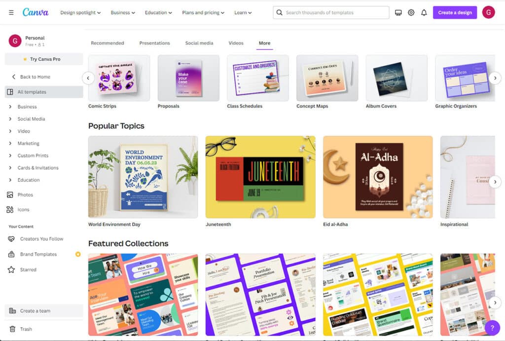
With templates available for social media graphics, business cards, brochures, photo collages, book jackets and more, my head started to swim a little. I eventually decided to do a simple, full page, portrait oriented flyer to get a quick sense of the design process.
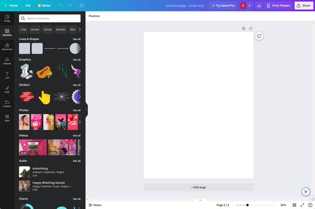
Adding (moving, removing) elements
The number of elements and graphic art pieces was absolutely astonishing. My first plan was to make a fake flyer for a writing job, and I spent a fun few minutes adding, moving and deleting typewriters, bits of paper and paper airplane illustrations.
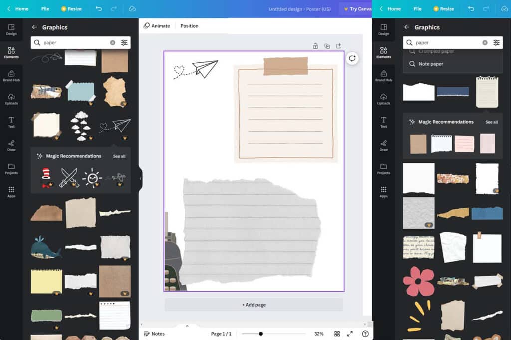
While I didn’t end up using any for my eventual project, I was reminded strongly of looking through an extremely well stocked and organized scrapbooking drawer. My one criticism is that there aren’t a lot of free options compared to premium/paid content.
Choosing a layout
Choosing or developing a layout for your piece is important, as is having all your text and information prepared beforehand to include in the design process. With that in mind, I fell in love with some vintage paper elements early, and initially decided to do an ad for guest writers at the CodeDesign blog almost entirely based on this aesthetic.
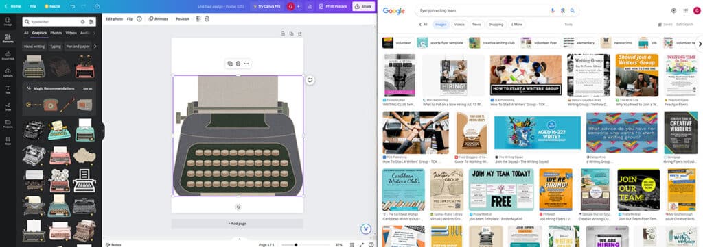
Having mostly used things like photoshop up to this point, I hadn’t realized what a luxury being able to pull things off the artboard without deleting them was until I had to go without.
After some reflection, I reluctantly put aside this project and decided to create something for a real world event.
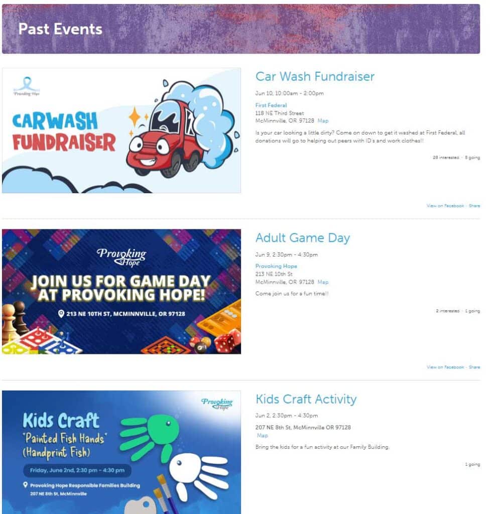
I decided to go with the carwash event. I transposed a Facebook event ad for Provoking Hope, a local non profit, into a full page flyer design. This had a few benefits:
- I had all the text and information that I needed at hand before I started
- I had all the images that I needed
- The theme and tone of the event was already provided
If you decide you don’t want to create your own layout, you’ll never run out of template options in Canva.
Template, text and font
Source material in hand, I decided that trying a template might not be so bad after all.
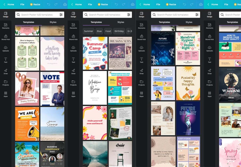
While the number of full page, portrait oriented flyer designs was overwhelming, there were a few specific trends that stood out to me:
 A simple/abstract background with no other images, a very bold headline and body text
 Frames for photos. The purpose of the design is to provide a backdrop for photos or content images
 Infographic/content boxes: Sections of content in visual containers, main info box more prominent with smaller or less dynamic supporting paragraphs
I really liked the layout and typography in newspaper style poster being used for a birthday party.
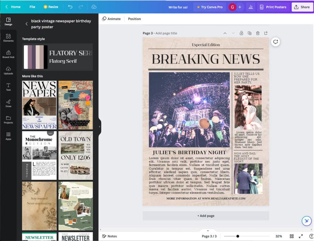
Keeping the newspaper theme, I rewrote the carwash event blurb into that style. I kept the original fonts (Flatory serif for the headline, and DejaVu serif for the body text) and played with images and text sizes a little bit.
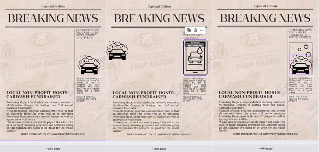
I needed a few more images to fit the right hand column, so I went with a simple line illustration for the top and eventually a logo of the event’s sponsor, First Federal, below. Because it’s a newsprint style, I decided to take out the bulk of the white from my graphics and allow the aged paper background to provide the highlights.
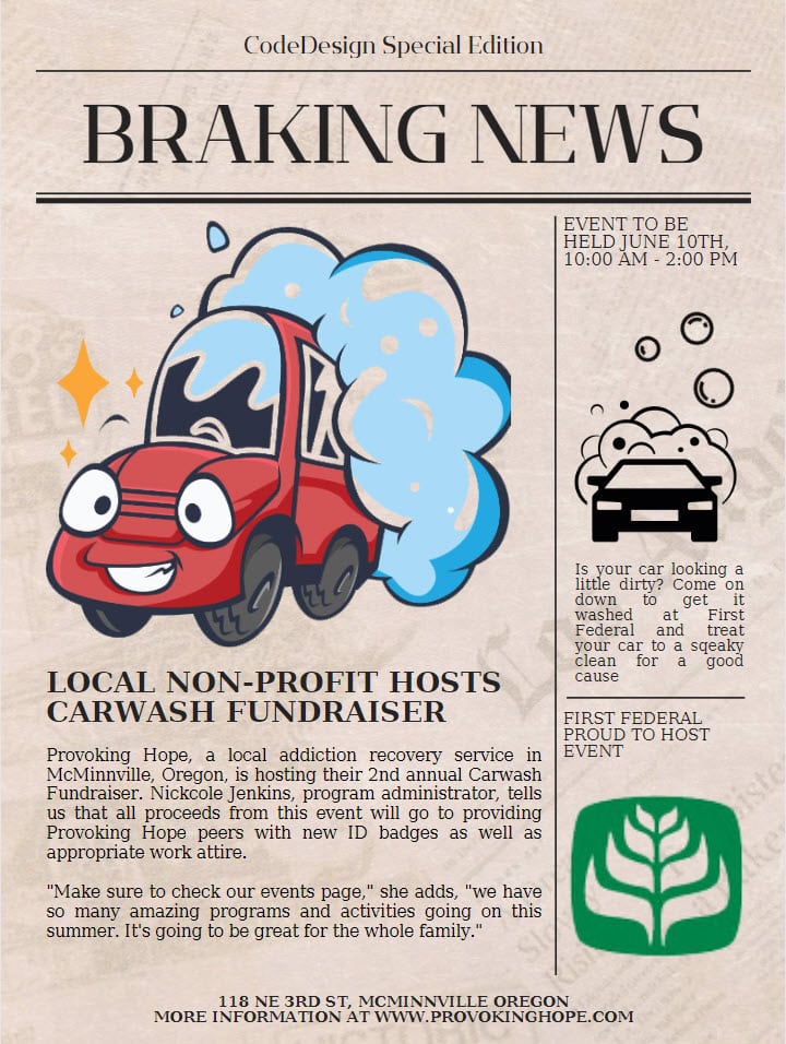
And with some proofreading, added info, tweaks to the spacing and a very important pun opportunity taken in the headline, I’ve finished my quick and easy, 30 minute event flyer!
Saving and Downloading in Canva
Premium content
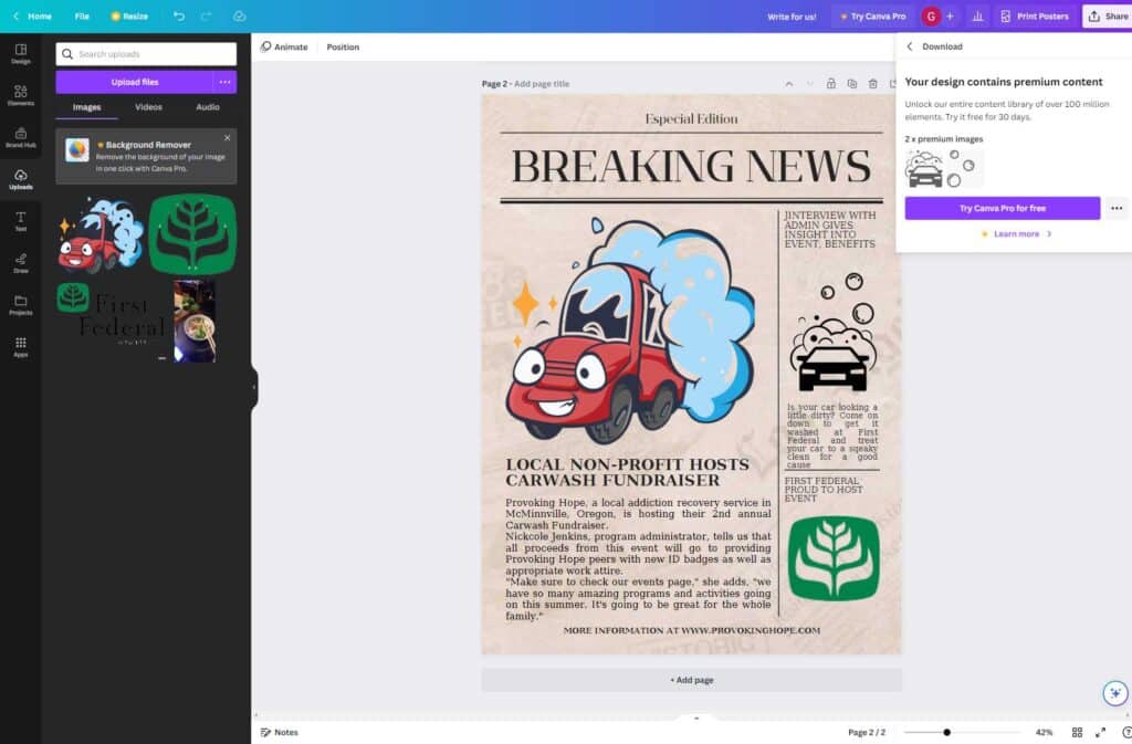
For the most part, the creation process in Canva is absolutely unlimited. Until you’re ready to download your pieces, there’s nothing preventing you using premium content pieces (which, unfortunately, are the majority of the available elements), and you can happily lose a whole afternoon putting ideas together.
This is great for casual users, and it’s great for Canva: Users get to mess around with plenty of options, and by the time they have a finished product they’re ready to use, the price of the subscription is weighed against the time and effort spent building the piece.
Since I had only used 2 premium pieces and don’t expect to need an ongoing supply, I was glad to see that they offered an a la cart option to spend $1 per element.
Resolution and quality lock
For my purposes, a 1700×2300 file isn’t too bad, but I’m also not intending to print it. This, I think, really illustrates the crux of my impression of Canva: it’s wonderful for amateurs, and extremely difficult to use if you have any requirements such as file size that don’t just depend on liking how the bauhaus design looks.
Frequently Asked Questions
Is Canva actually free?
It is very possible to create a fully free design in Canva, and download it (at a set quality level and resolution, of course) without paying anything. I will say, however, that the amount of premium content pieces do far outweigh the free offerings.
What can you make with Canva?
What can’t you make with Canva? Infographics, collages, graphs, book covers, mind maps, calendars, worksheets, and so much more.
Final Thoughts
I have a confession to make: While I had thought that I’d never used Canva before, it turns out that the web page and desktop app were new to me, but I had edited a social media post on their android app a few months back. Canva provides the same library of fun and interesting elements, (and a lovely auto-cropping-to-a-set-aspect-ratio for each of the big social media platforms) that made posting my Instagram update (who doesn’t love hotpot night?) a snap.
While I still don’t think this is the app I’d go with to do professional or printed work, it’s definitely a bright, interesting and exciting playground for fleshing out ideas and playing with different graphical and font combinations. Is there a specific feature or design you’d like to see included? Let me know in the comments, and have fun designing!
I also wanted to include special thanks to Provoking Hope, a substance abuse recovery service in McMinnville Oregon (United States) that’s supporting over a thousand members of our community each month.
