At CodeDesign, we’re passionate about non-profits, which come with unique web design needs: walk a fine line between clearly and cleanly delivering a message and providing accountability and openness, all without sacrificing slick web design and great features. Let’s check out some of our favorite nonprofit websites!
1: Child Haven
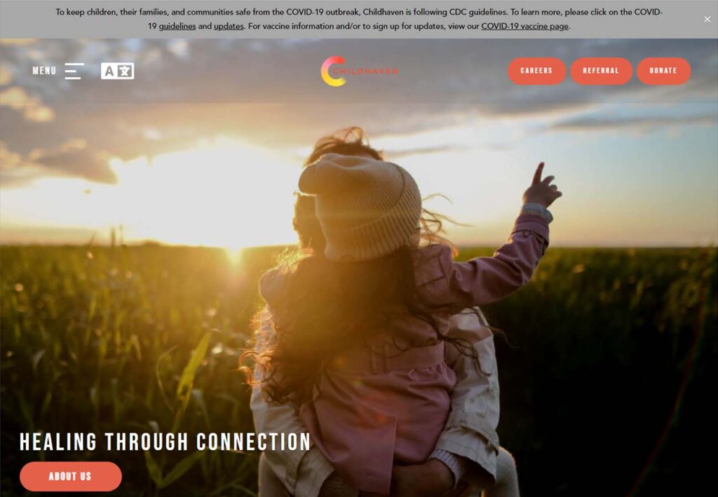
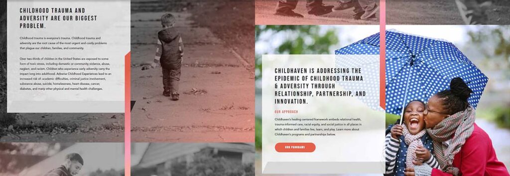
Child Haven is a great example of visual storytelling done right. The ombre divider on the homepage spans multiple images, tying them together into a cohesive and hopeful story, and the menu buttons in the header are clean but unobtrusive. We appreciate that website visitors are offered abundant opportunities to support their cause without being overwhelming, and the visual story imagery means that by the time the viewer reaches the bottom, they have a real emotional connection to the cause.
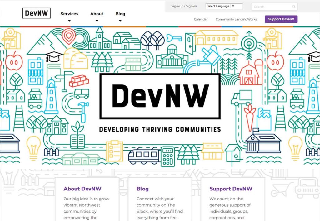
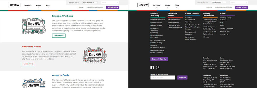
2: Dev NW
Dev NW doesn’t rely on photos at all on their homepage. Instead, simple but colorful linework illustrations for each section make for a neat and interesting front page, giving the impression of movement and busyness without feeling crowded. Below, the elaborate footer gives all the links and details in content columns, letting you look for something specific rather than forcing site visitors to browse through the lot of information.
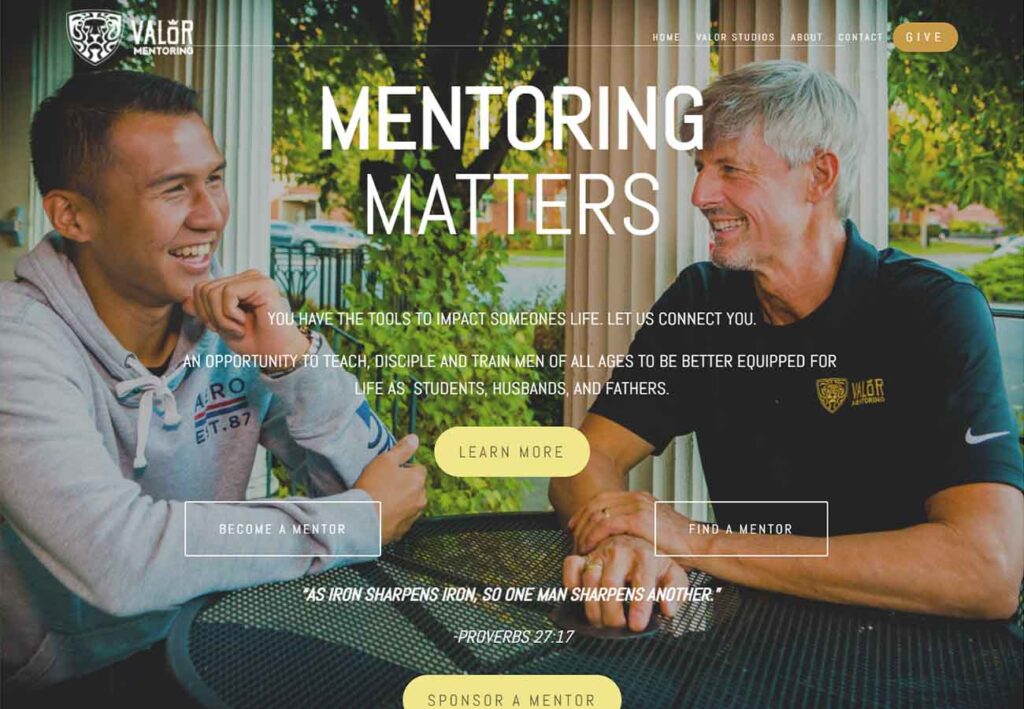
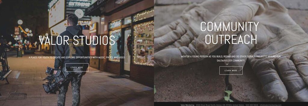
3: Valor Mentoring
Valor Mentoring is a charitable organization with a big mission and the web design chops to show it. Here we have an attractive, clean, simple home page that’s very visually focused. It doesn’t overwhelm the viewer with information but instead divides their site between 3 images with simple white text and a link box. A tried and true graphic design strategy, this site leaves a clear visual impression rather than overwhelming the viewer with everything all at once.
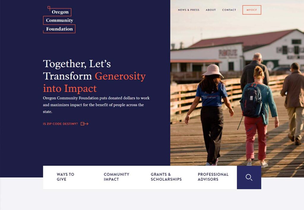
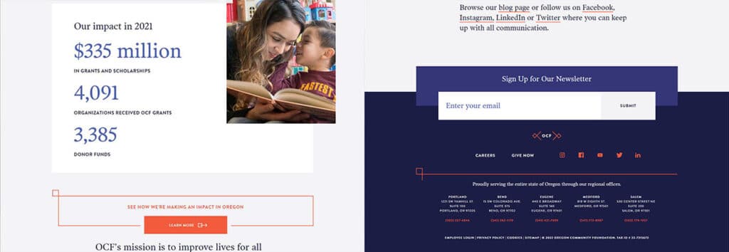
4: Oregon Community Foundation
Somewhere between the (excellent) extremes of our last two examples, The Oregon Community Foundation strikes a nice balance of images and brightly colored panels. This lets the eye rest on the organization’s mission and does a good job of highlighting important content pieces. The blue and orange color scheme is attention-grabbing without being overwhelming, and the orange graphic is a consistent theme that ties the page elements together.
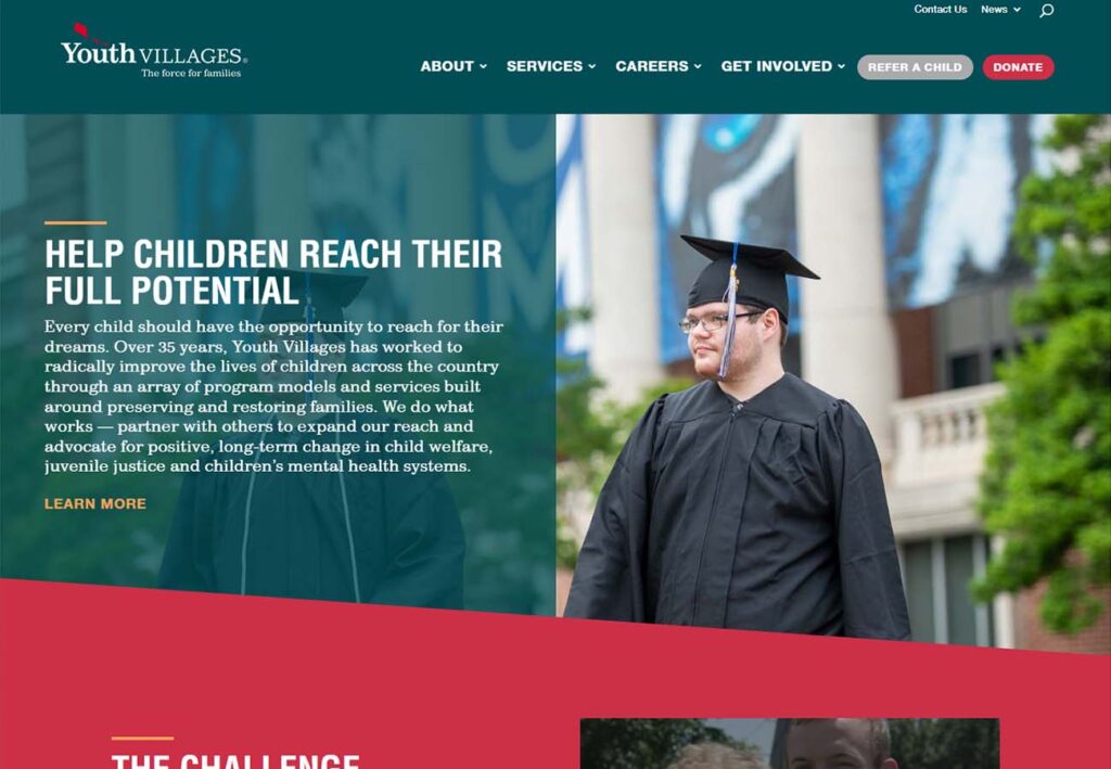
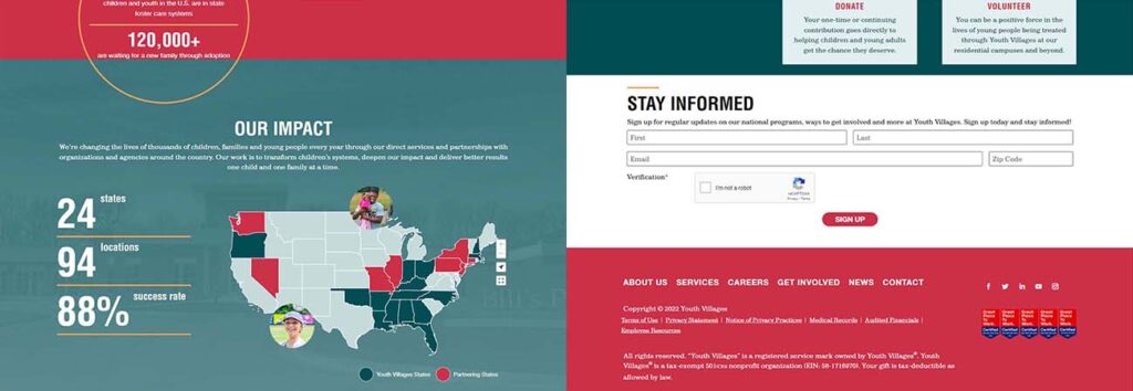
5: Youth villages
Youth Villages’ choice of contrasting red and green, not to mention the asymmetrical divide between content blocks, adds a lot of visual interest, and the dynamic map with clickable links to each state is just frankly neat.
We appreciate the balance they provide of abundant content blocks mixed with clean images and graphics, boosting user experience by providing powerful storytelling for both visually focused users and those that prefer information via text. Add to that the easy navigation and valuable resources, and this is one darn good nonprofit website.
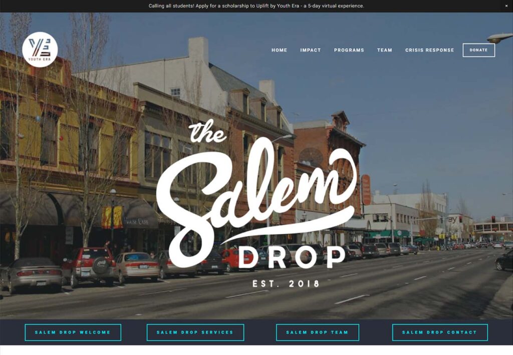
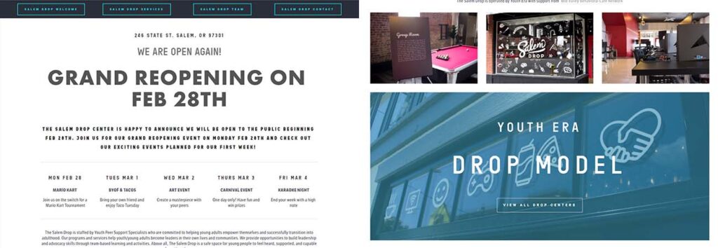
6: Salem Drop (Youth Era)
Youth Era’s Salem Drop website just feels informative. Clean with a good balance of bright and dark, the font sizes lead the eye comfortably and serve to break up what would otherwise be a great wall of text. Good accessibility features, clear navigation and a, well, actionable call to action. The calendar, which looks almost like something you’d find in newsprint, is subtle and never feels cluttered while keeping abreast of upcoming events- something often difficult to do with a full page of black and white text.
https://www.youthera.org/salem-drop
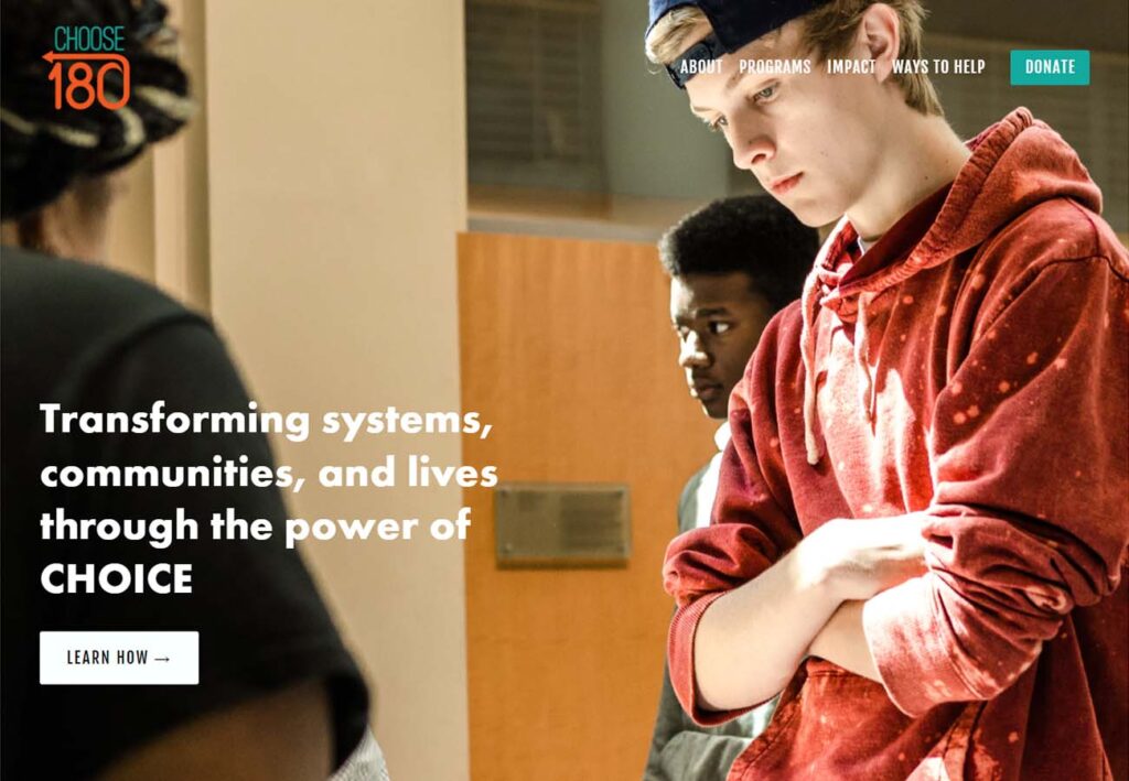
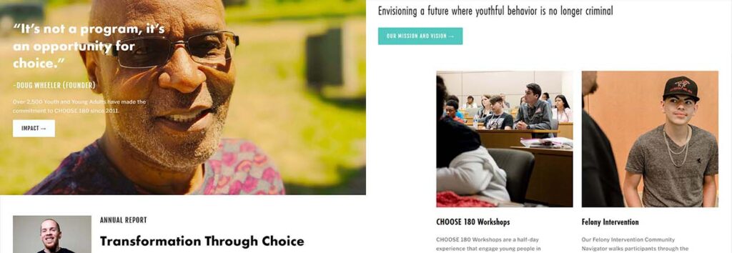
7: Choose 180
Choose 180 uses a nice mix of slick full page images broken up with multi-line information blocks. Curious visitors will find their colors are clean and dynamic, their website’s content informative, and their calls-to-action impactful.
Add to that a nice mix of donor information and just enough minimalist marketing to showcase their mission statement makes this one of the best nonprofit websites on our list.

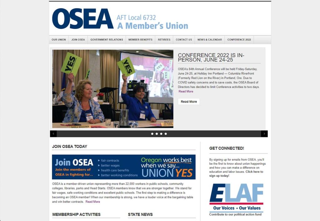
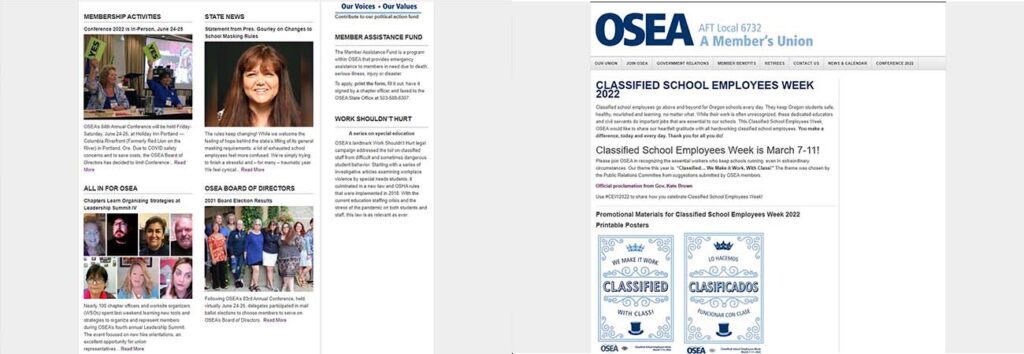
8: OSEA
OSEA is a great example of a website that embraces its wealth of content on the front page. Harkening back to the days of magazines and printed flyers, the layout gives it a nostalgic and comforting feel without sacrificing readability. This is particularly effective for fundraising and advocacy efforts, and a good reminder that important storytelling can be found in the design as often as the content.
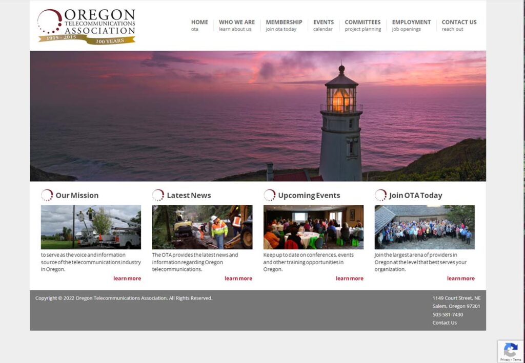
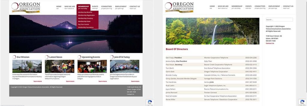
9: Oregon Telecommunications Association
Oregon Telecommunications Association is showing its internet and nonprofit website design chops with this simple but beautiful front-end. They’ve chosen a dark red and light gold as their main colors, tying everything together on their content pages and educational resources with pops of bright color throughout.
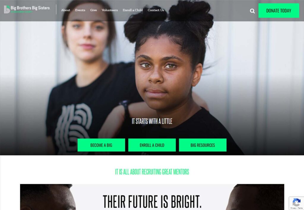
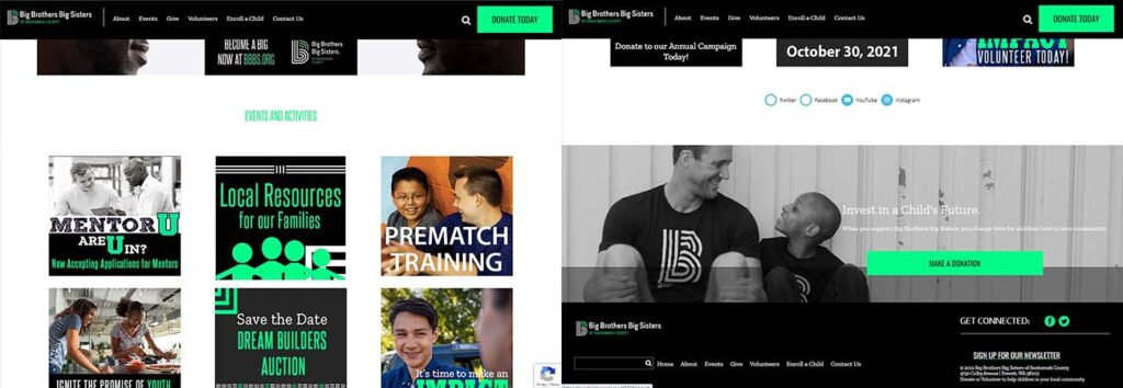
10: Big Brothers, Big Sisters of Snohomish County
Last but not least, Big Brothers, Big Sisters of Snohomish County presents a clear color scheme, using a bright green that shines through the dark graphics throughout to highlight donation forms, contact information and places new supporters can interact with the page.
The social media links can be found in an interesting mid page content block, help give the eye a place to rest, and we love how the intuitive navigation menu changes from semi transparent to opaque as you scroll down the page. Studies show that having an online presence has a significant impact on a nonprofit organizations sustainability as an entity.