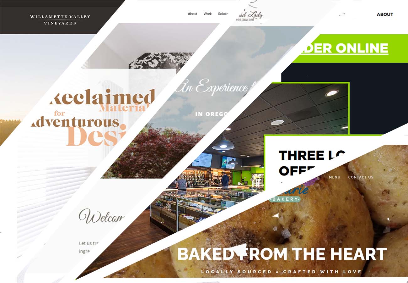
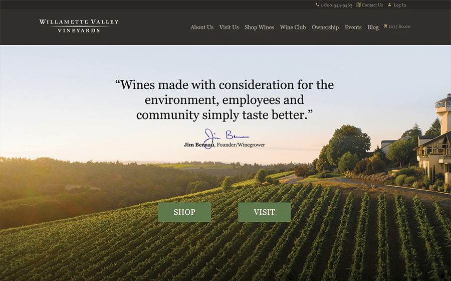
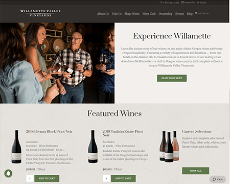
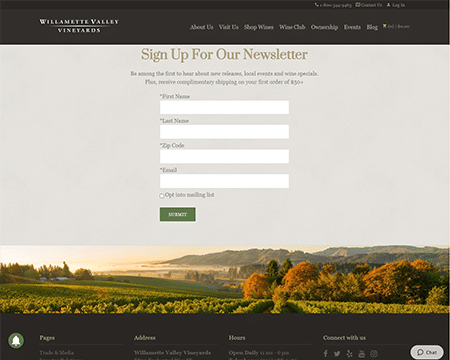
Willamette Valley Vineyards, Turner OR
What we love:
Focussing as much on the experience of living and working in the Willamette Valley as selling their product, WVV strikes a great balance between advertising their physical location and managing online sales. We love the combination of information and tasteful product placement on the front page, and the clean block of social media icons in their contact section earns extra kudos.
The Painted Lady, Newberg OR
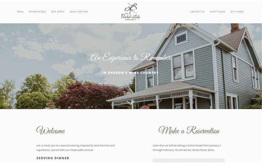
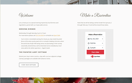

What we love:
The Painted Lady’s website perfectly reflects the atmosphere of the restaurant, using simple and elegant elements that are easy to read but don’t overwhelm the page.
Everything needed to book a reservation is available on the front page, including a clever Open Table integration. We also love how consistent and polished every page on the site is, and the idea of including a recipe list as an incentive to sign up for their mailing list is nothing short of brilliant.
Barnwood Naturals, Salem OR
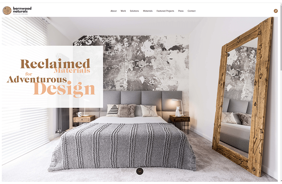
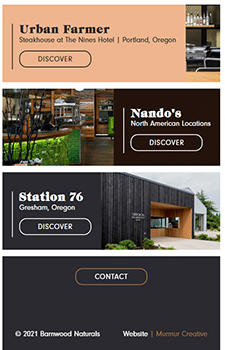
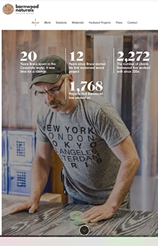
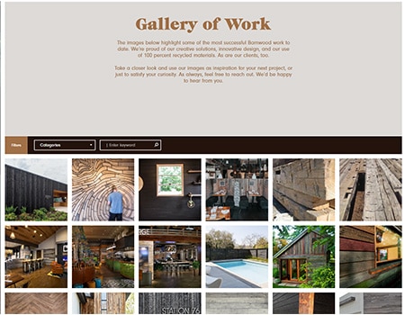
What we love:
We’re suckers for designers who incorporate gorgeous, reclaimed materials. Check out how nicely the site changes between desktop and mobile view, using a cleaner pared down design for smaller screens. The contrast between the simplicity and cool colors of the hero with the warm tones and busyness of the content below makes it feel intimate rather than chaotic, and their gallery of work is a joy to explore.
Green Cross Cannabis Emporium, Bend OR
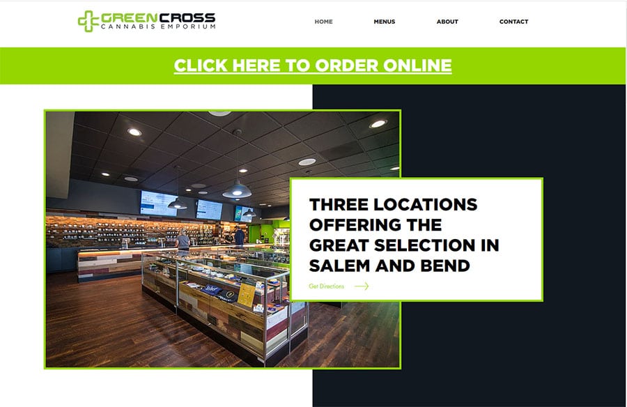
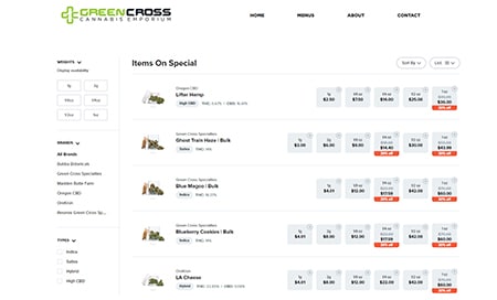

What we love:
Legal cannabis being relatively new, standard features between sites are only starting to become apparent. Featuring separate menus for each of their locations, Green Cross Cannabis Emporium uses Dutchy to manage their inventory and allow online ordering for pickup.
We love the layered, recessed blocks on the Hero section, and the use of negative space breaks up what could have easily been too much room for small sections of content.
Baker’s Prairie, Canby OR
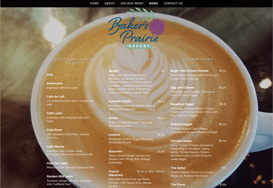
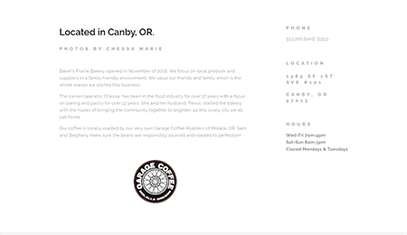
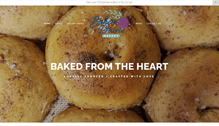
What we love:
How cute is this simple, single-page site? With a unique store menu as the crown jewel of the page, Baker’s Prairie is a small, intimate coffee shop and bakery that focuses on what they do best: delicious food and drink, and their web presence reflects that perfectly. Not everyone has enough content to fill multiple pages, and creating a sprawling website that’s too big for the content available only takes the focus off of what’s actually there.