Today’s local business website feature is focused on hair salons and stylists. Like many other types of artist, having an online presence that highlights their skills and portfolio is crucial for attracting new clients. Smart choices we appreciate include mobile booking, clean and functional services menus and stylish stylist bios.
Let’s check out our ten favorite salon and stylist websites for some serious web development and hair inspiration.
1: Urban Colorz Salon
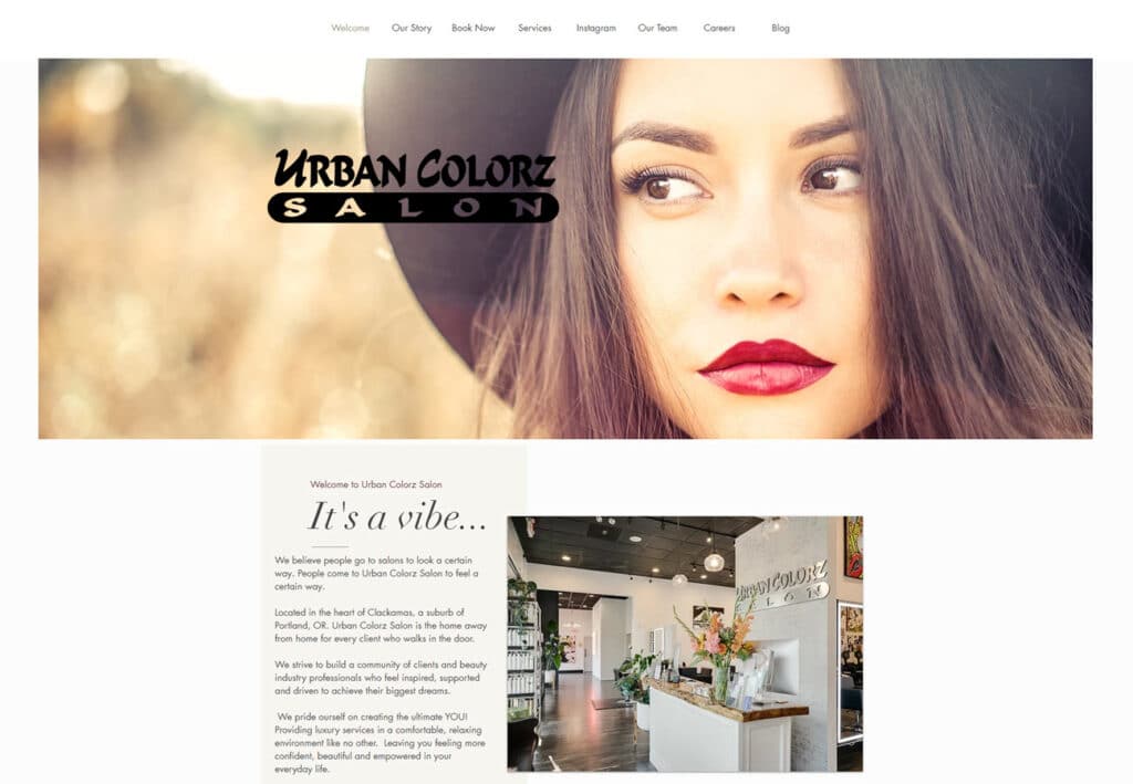
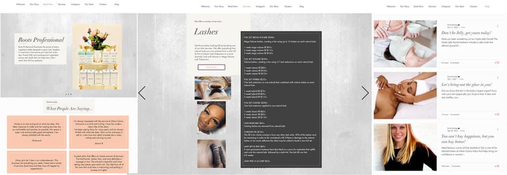
Urban Colorz features a slick, well developed page layout and a soothing color scheme that ties in excellently with their photos. Beautiful images, clean and tidy page sections / elements, and a nice mix of images and text leads the user naturally to appointment booking and the download of their app. It’s also nice to see a blog, which does as much for a site’s SEO rankings as it does for customers using the website.
https://www.urbancolorzsalon.com/
2: The Red Chair Salon & Spa
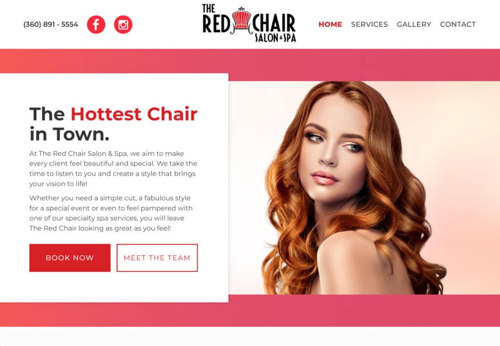
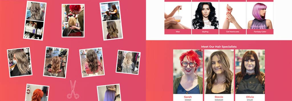
Bright, bold and energizing, The Red Chair’s website makes great use of a simple red + white color scheme. We love how easy to find the online booking is, and how fantastically it scales to mobile devices. The images are crisp and nicely aligned, and the gallery of rotated photos brings to mind a table spread with bright, colorful Polaroid photos.
https://www.redchairsalonspa.com/
3: Salon Havana
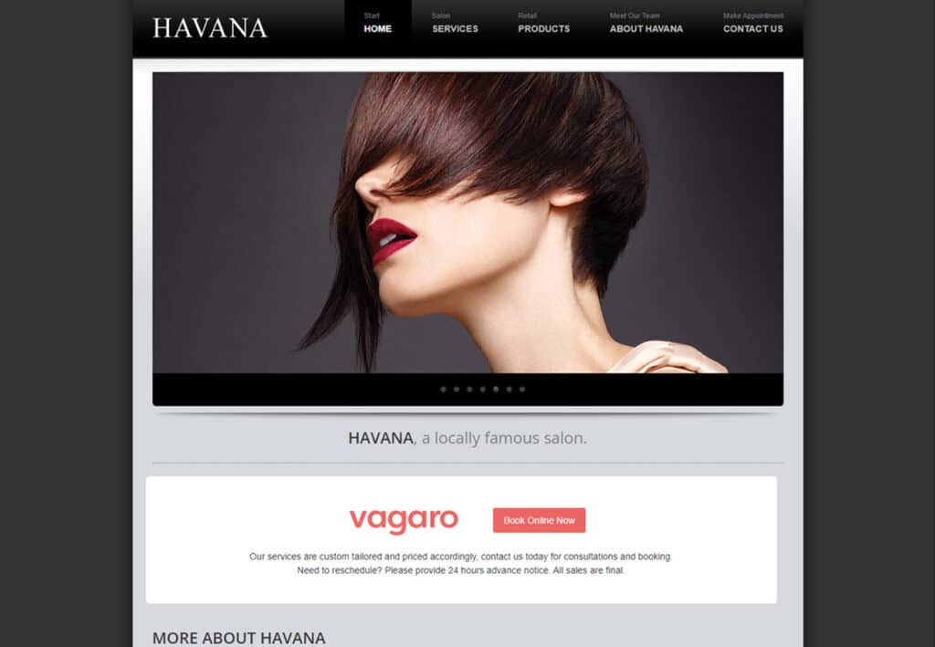
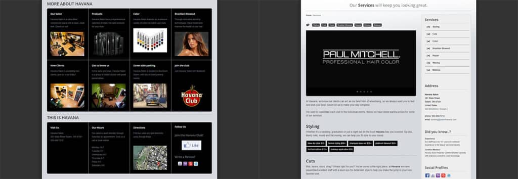
Another sleek and professional website, Havana goes in a completely different direction with a clean and minimalist color palette in shades of gray. This nicely highlights the smart use of content blocks and varied text sizing, as well as the obviously high quality and professional images. We’re huge fans of designs that center content without sacrificing a clean, functional workflow.
https://www.salonhavana.com/
4: Radical Rubies
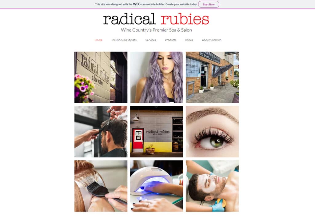
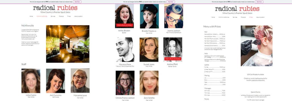
We’re thrilled to feature a business from our very own hometown of McMinnville! Radical Rubies is a great example of a simple but effective website created with an online web creation platform. While this won’t provide the truly custom design options that a professional developer might offer, it’s very possible to make a beautiful and functional site using simple grids, columns and dropdown menus. Note the nicely spaced text, clean layout and front-and-center photo gallery.
https://www.radicalrubies.com/
5: Chameleon Salon
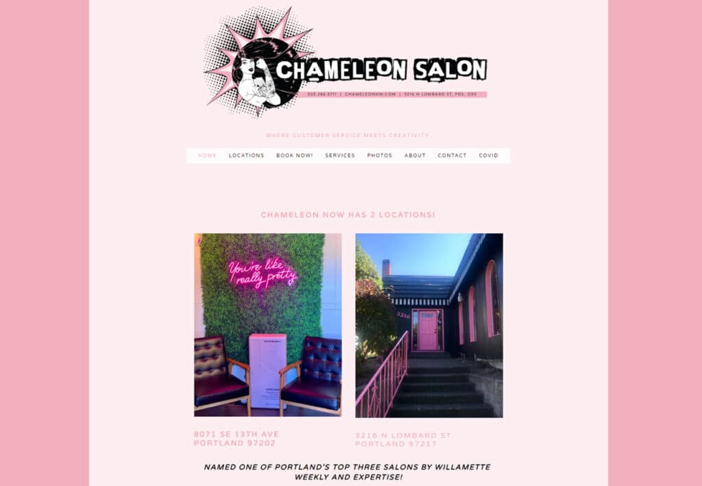
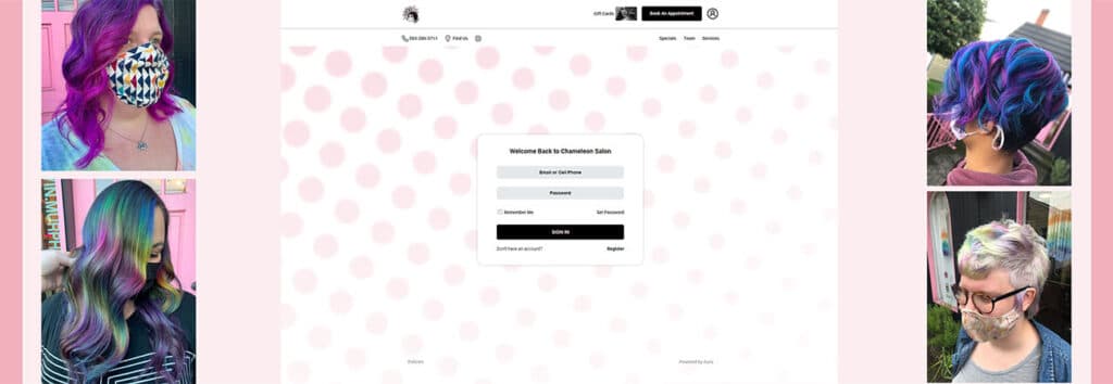
What a trendy, fun and eye-catching style! Great colors and the use of soft pinks and whites balances the bold comic / pop art illustrations. Nice use of varied font sizes and colors, and while it is relatively light on images compared to some other examples featured here, the bold and fun style keeps it interested.
While you’re on the site, note their “Best Hair Salons of Portland” award: surprisingly few people take the time to format their site around awards or commendations, instead trying to tuck them in an existing section they only somewhat-fit. This is deservedly front and center.
http://www.chameleonnw.com/
6: Ginger & Maude
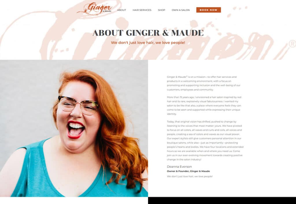
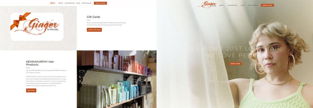
Ginger & Maude’s homepage is relatively short, featuring a single lovely video per session (did you notice that instead of having an image or video carousel, the video remains in place until the session is refreshed? This is a smart choice if you’re looking for a simple, soothing effect that doesn’t distract from the information below.)
The touches of orange in a generally neutral color scheme add a bright pop of interest that references the name of the business, and the services menus are laid out like a physical menu, which adds an extra layer of smoothness and professionalism.
https://www.gingerandmaude.com/
7: Salon Beck
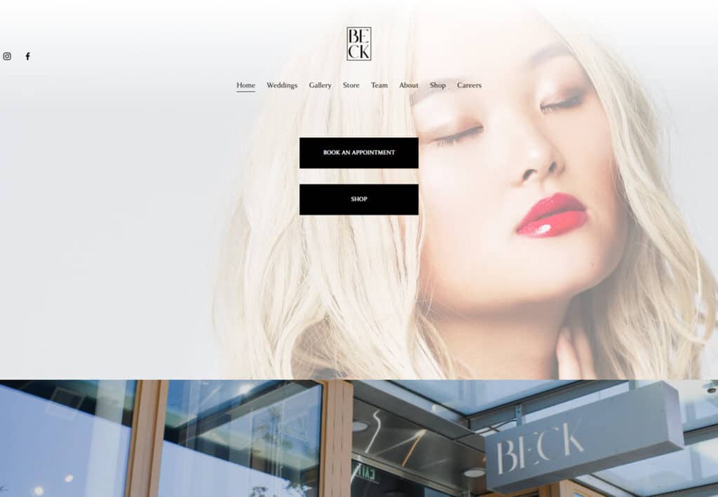
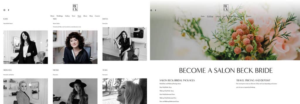
For a business that has a primary customer group, like Salon Beck clearly has with weddings and bridal packages, designing around those services is just good sense. We appreciate the smooth transition between content blocks, and the image-only sections gives a nice place to rest the eye while traveling down the long homepage. The team bio section is simple and clean, and the overall effect is that of a glossy magazine spread.
https://www.salonbeck.net/
8: Salon Nouveau
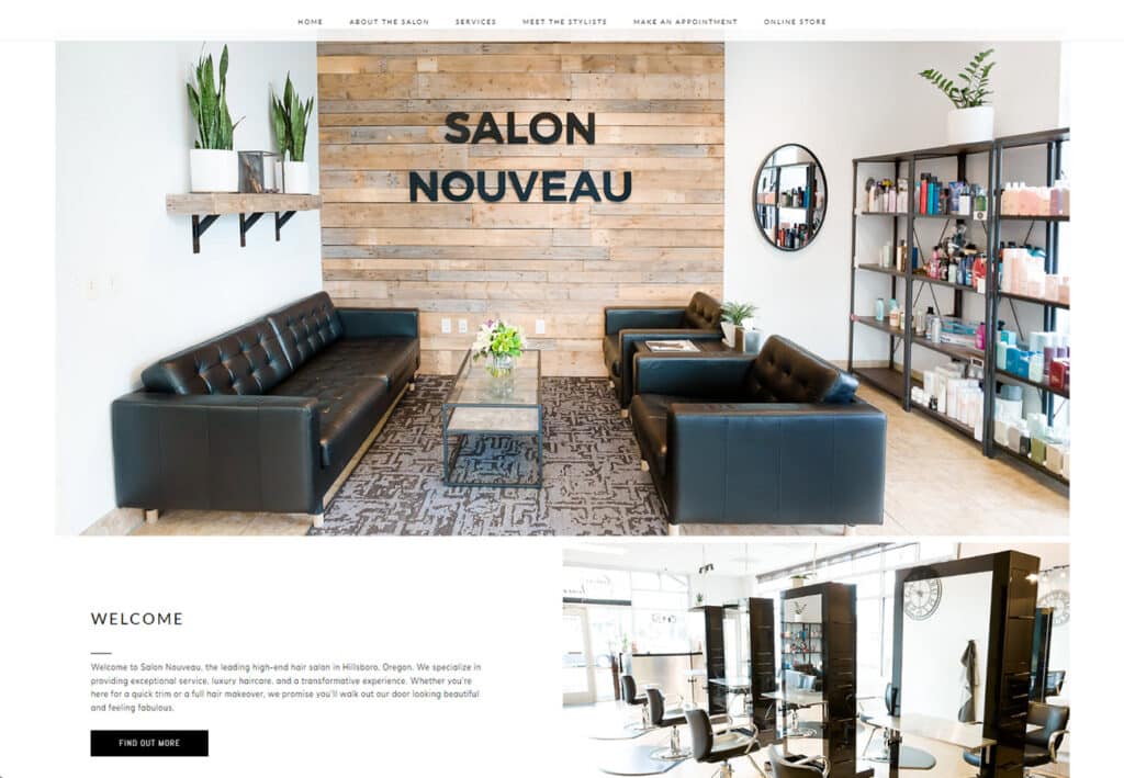
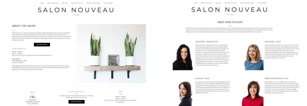
Another clean and stylishly minimalist website reminiscent of an upscale magazine, we love Salon Nouveau’s easy-on-the-eyes simplicity and great use of whitespace. Using product images as the background for featured customer reviews is a smart use of both graphic design and product-placement, and the occasional pop of color from a photo adds visual interest without unbalancing the design.
https://mysalonnouveau.com/
9: North Albany Salon
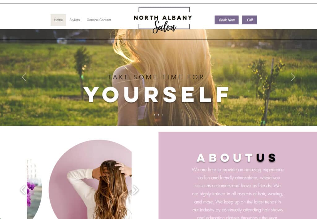
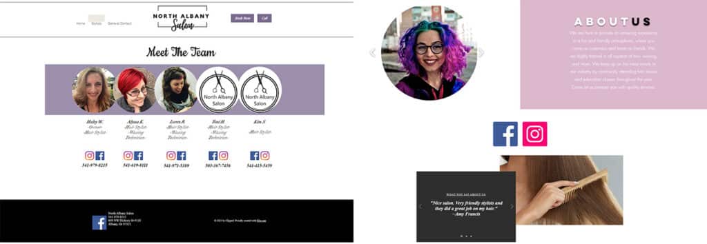
North Albany Salon’s website is pretty, bright and nicely laid out. The differently shaped image cutouts add visual interest, and the social media icons are displayed prominently in a way that enhances rather than detracts from the overall effect. Each stylist has their own page in the dropdown menu, which is a smart way to highlight differences in pricing and services, and not something you see very often.
https://www.northalbanysalon.com/
10: Ahead of Style Salon and Spa
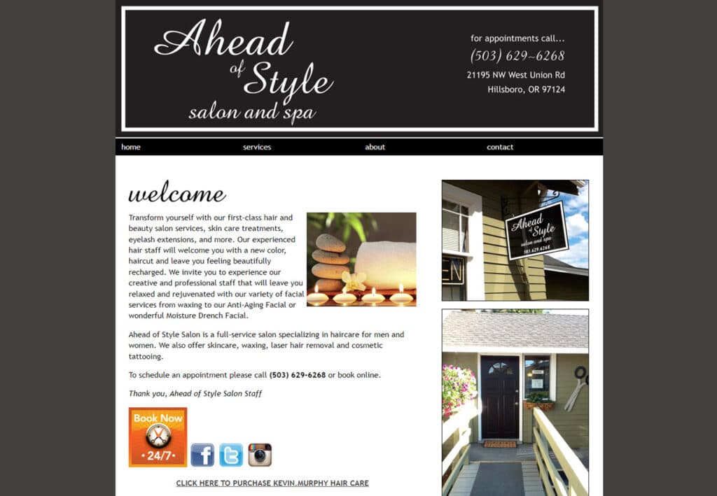
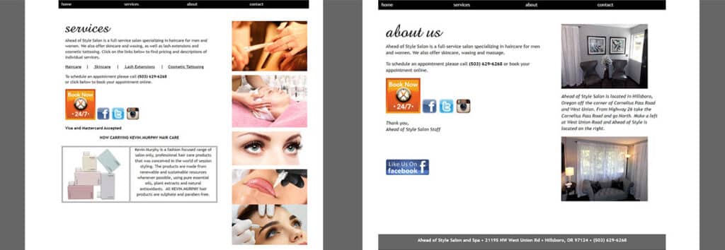
Sweet, simple web page tucks all its information into 4 single page sections. Images and text are stitched together cozily without overwhelming the eye, and keeping it short and simple doesn’t take at all away from the function or appearance of the website. We love to see good contrast between the text and background, and everything is cleanly laid out and easily visible.
https://www.aheadofstylesalon.com/