Why was the broom late? It overswept. Ahem, now that we have that out of our systems, join us for our latest top 10 industry feature: Cleaning services!
1: Broomed Cleaning Services
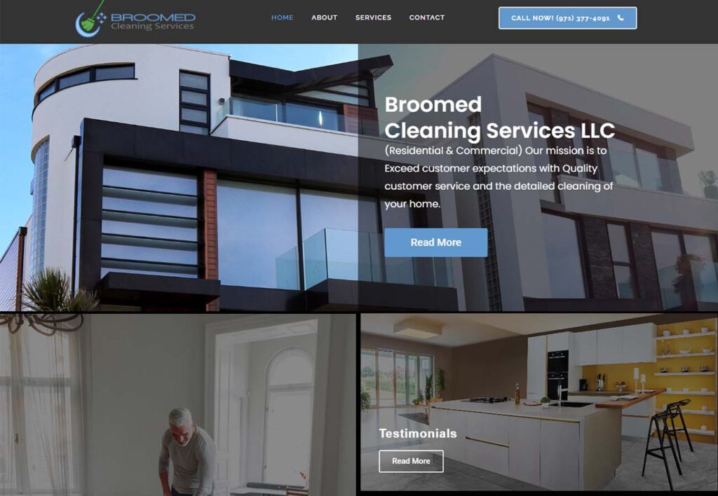
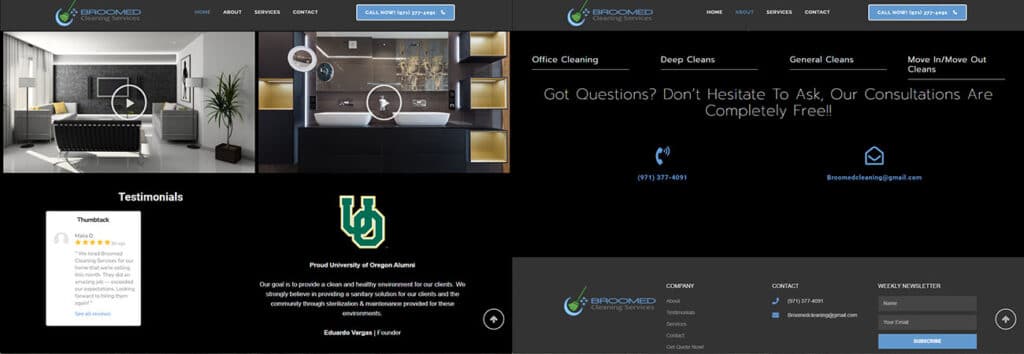
Let’s start off with Broomed Cleaning Services: there’s lots to talk about with this sleek and stylish website. Using a clean image grid over a black background gives a sense of cohesion and abundant content-just what you’re looking for when it comes to before and after images and testimonials.
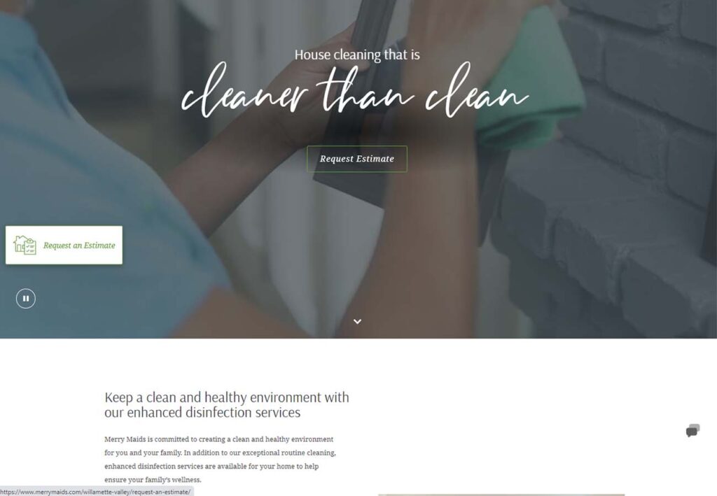
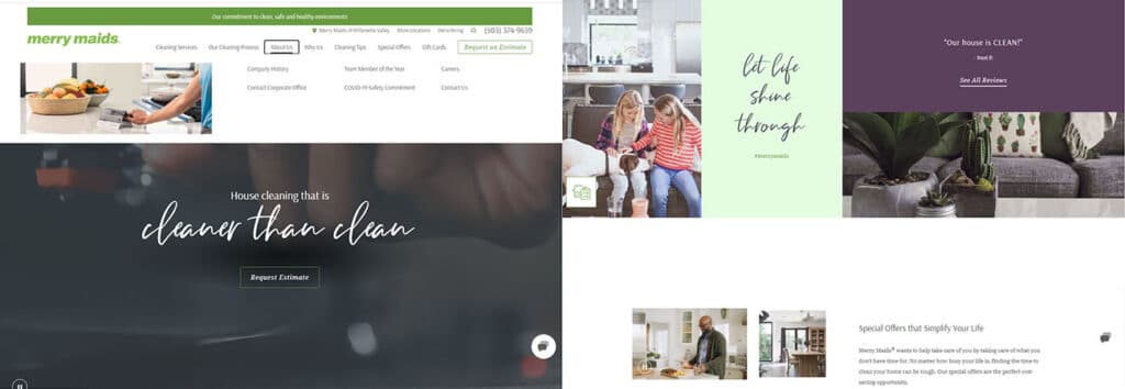
2: Merry Maids
Merry Maids Cleaning is a great example of a site designed for a large franchise company. Because their brand spans so many individual businesses and locations, their strategy has to balance services with the shared experience of enjoying a clean home: something that’s universal no matter where in the world you are. We love the ample opportunities to request an estimate and the pleasant transition from the soft dark hero image to the clean and crisp content below.
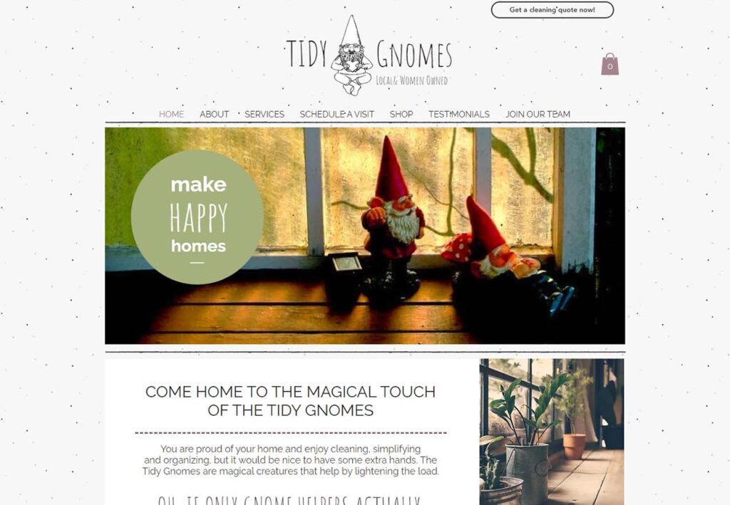
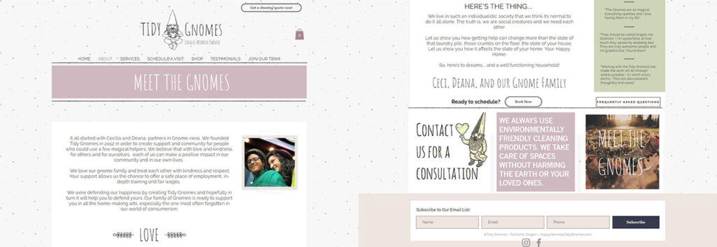
3: Tidy Gnomes
On the other side of the spectrum, check out this entirely customized (and oh-so-sweet) layout by The Tidy Gnomes. Reminiscent of bullet journaling and scrapbooking, this site is a breath of fresh air. Fun and cohesive, Tidy Gnomes doesn’t just show you how clean your home can look, it shows you how warm, inviting, and friendly it can feel with a little help from your gnome friends.
4: Rise and Shine Cleaning
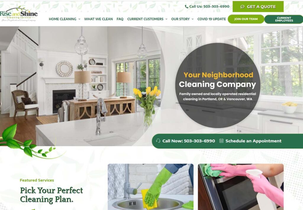
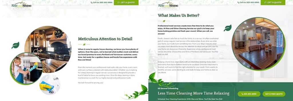
Who said lots of colors and detail had to mean cluttered? Rise and Shine Cleaning wants to show you all the services they offer and let your eye jump from detail to detail: much like their hardworking employees! We love the circular graphics, gorgeous green color scheme, and fun leaf motif that ties it all together.
5: Warm Welcome Cleaning
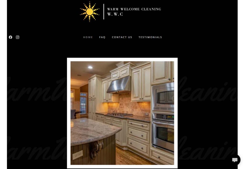
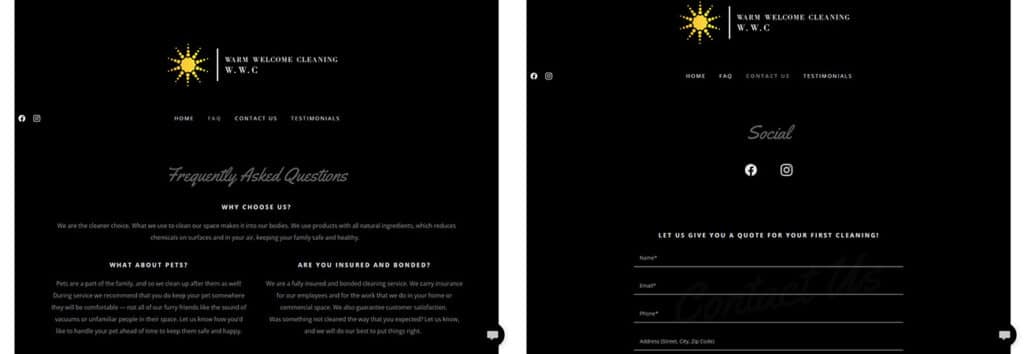
Warm Welcome Cleaning’s website is very true to their name. Using a simple logo and consistent font and layout, the warm sunshine logo shines from the header. We appreciate the example of simple, cleanly crafted design.
https://warmwelcomecleaning.com/
6: The Tidy People
Okay, okay, The Tidy People’s full website isn’t available to feature right this second, but hear us out: How many times have you headed over to a site that’s in the middle of a remodel and found broken links and lorum ipsum? A “Be Right Back” page is such a simple way to maintain the aesthetic of a website while giving your developers a little breathing room to do their work.
https://www.thetidypeople.com/

7: Oregon Pro Maids
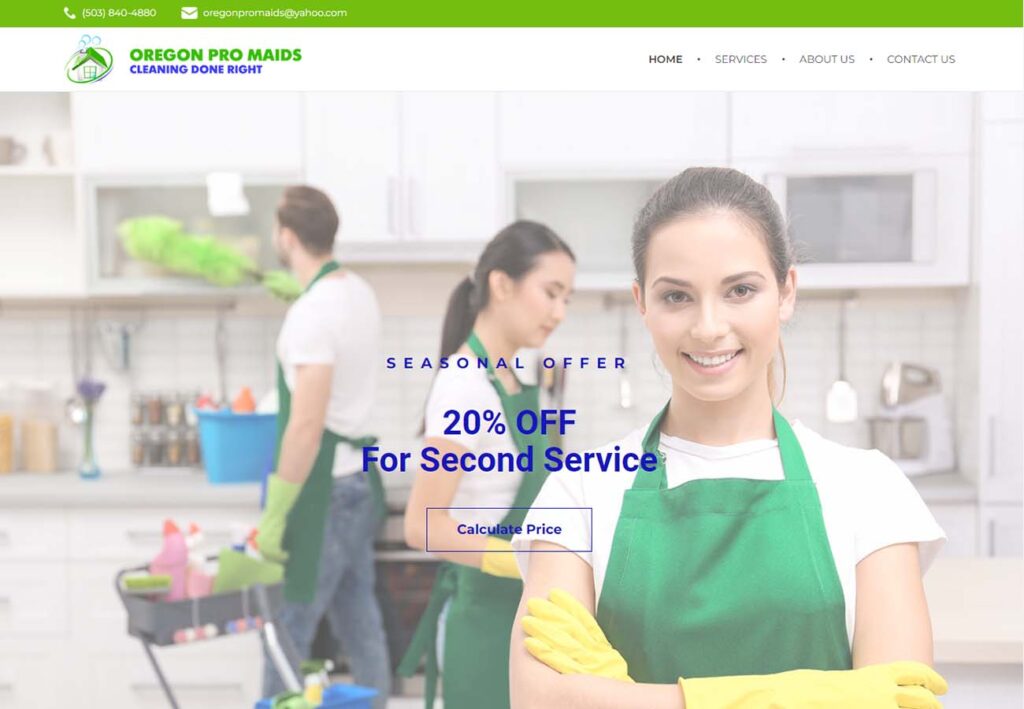
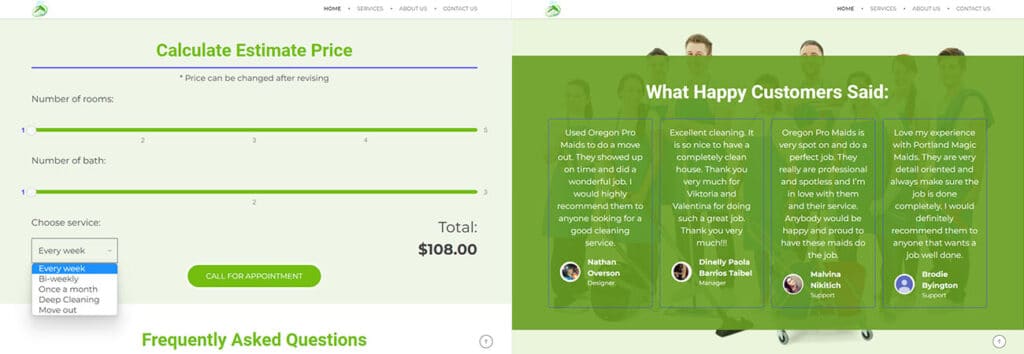
Another sleek design, Oregon Pro Maids knows what looks professional and does it right. From a seasonal offer front and center to a clever price estimator and lots of well-featured customer testimonials, nothing gets in the way of booking a great cleaning service.

Free Custom Mockup
We deliver a free website mockup in 7 days. No future obligation or cost, guaranteed!
8: Serenity Cleaning
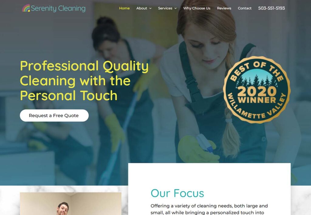
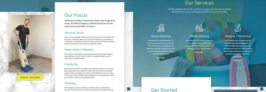
Serenity Cleaning’s website is like a breath of fresh laundry softened air. Their dynamic color scheme, crisp content sections and soothing images give a refreshing feeling that’s perfect for anyone looking to spruce up their home or business with a good cleaning.
https://serenitycleaningllc.com/
9: Schopp’s Home Maintenance
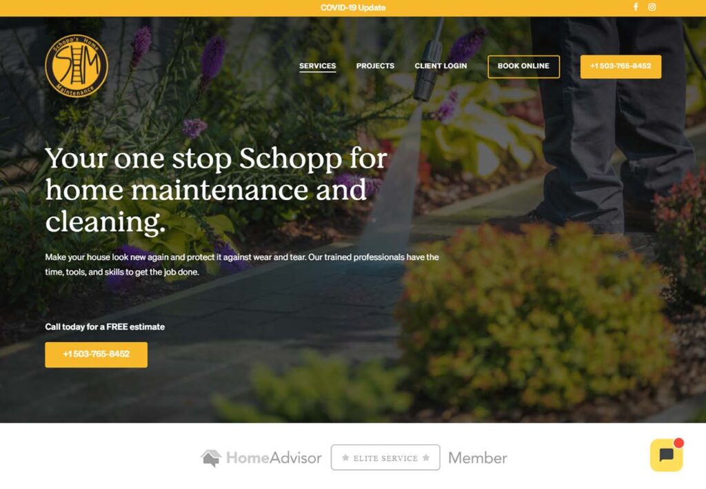
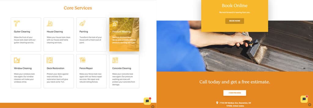
Schopp’s Home Maintenance offers both interior and exterior cleaning and repair services, so the bright and woodsy atmosphere is a perfect choice. Using a cohesive, sunny yellow color scheme to tie everything together, we love how the menu grid, which lights up with a photo when you hover over it, reminds us of looking out a window.
10: Alida’s Custom Cleaning
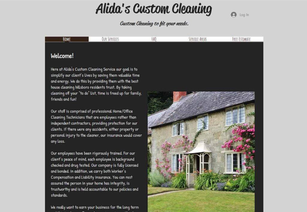
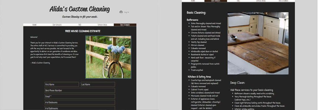
How cozy and comfortable is this small business site? Alida’s Custom Cleaning is a small business with an inviting and intimate feeling. The photos are simple and pretty, and the uncomplicated menu bar amplifies the personal and personable atmosphere.
https://www.alidascustomcleaning.com/
