When you think of event planning, what comes to mind? In an industry where appearance and style are so important, there are as many design options as there are events to be held. Whether it’s sleek and modern or cozy and intimate, let’s discuss our favorite layouts, styles, and designs.
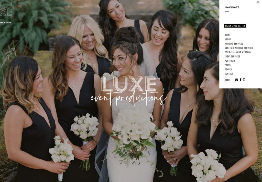
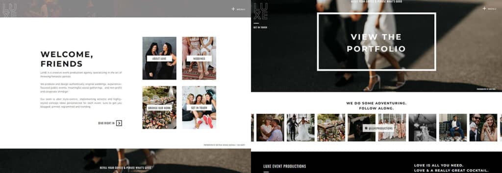
1: Luxe Event Productions
The full-page hero image is a bold move, pushing content down and immersing the viewer in the atmosphere created by their stunning, high-quality (and high resolution!) photos. Notice the minimalist menus and content sections, broken up by clean, uncluttered white space and uncomplicated font.
2: Adornment Events
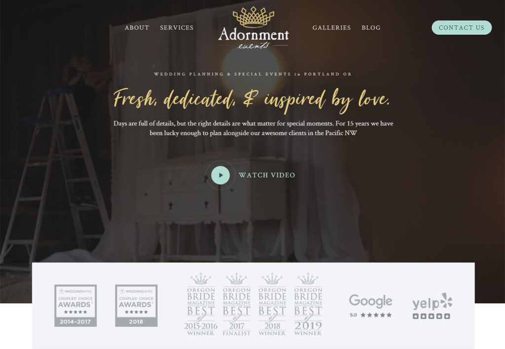
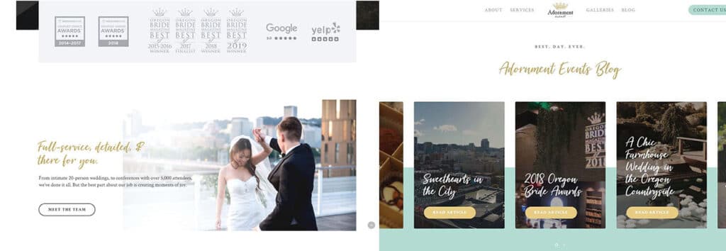
Adornment is a great word for this gorgeous site. We love the gold cursive style font and bright splash of teal as you scroll towards the bottom. The unique layout of their blog section stands out, and the tasteful use of color blocking gives a sense of cohesion to the many elements on the homepage.
3: Event Cracker
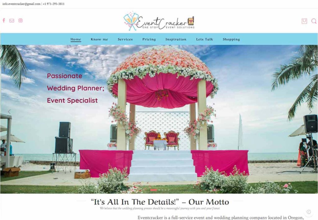
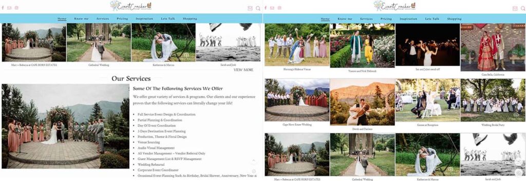
How colorful and engaging is this website design? With bright colors, lots of content, and a great use of element blocks, you can feel the excitement and intimacy this company provides. While it might not be the sleekest or most modern layout, matching design to a company’s personality is something to be proud of.
4: Blue Wings Event Planner
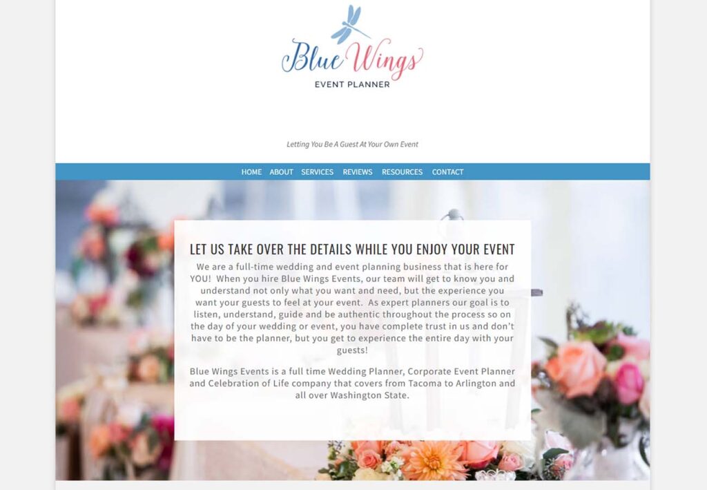
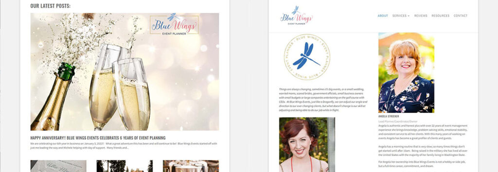
While the sites featured so far might make more use of whimsical design elements, Blue Wings Event Planner opts for a more classically structured site. With a simple, top-down layout and lots of room for their logo to shine, the overall effect is both tasteful and pretty.
https://www.bluewingsevents.com/
5: GFS Events
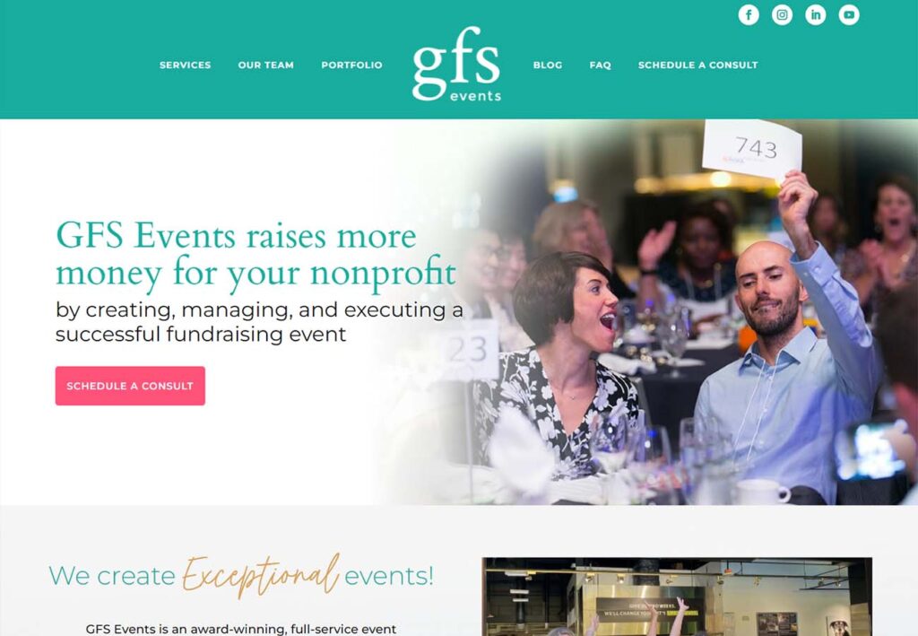
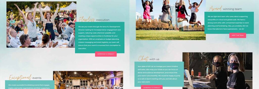
Now for something a little different. GFS Events focuses on fundraising and nonprofit events, and they’ve structured their site accordingly. Busy but cohesive, the vibrantly contrasting buttons stand out on a soft aqua splash image, and the photos and videos featured throughout the home page give a sense of excitement and success that strengthens the brand.
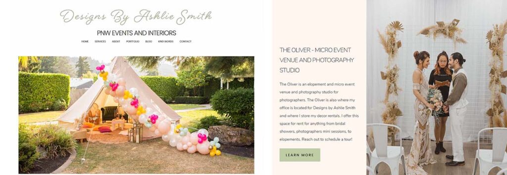
6: Designs by Ashlie Smith
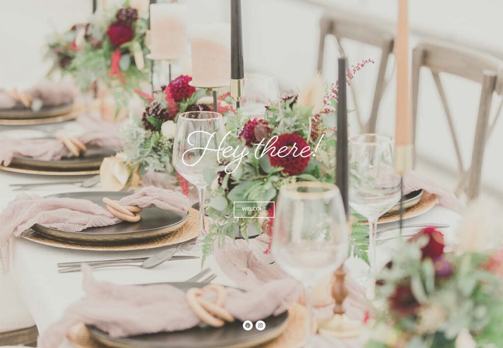
This one is an interesting choice! While it isn’t the first site we’ve featured with a single (beautiful) image as the introduction to the page, Designs by Ashlie Smith takes it one step further and makes the hero image the entirety of the home page. It’s a small gamble that pays off, lending a sense of intimacy and setting the mood before the user sees the full scope of what they have to offer. Clicking the “Welcome” button feels almost like stepping through a garden gate on the way to a party.
https://www.designsbyashliesmith.com/
7: Privé Events
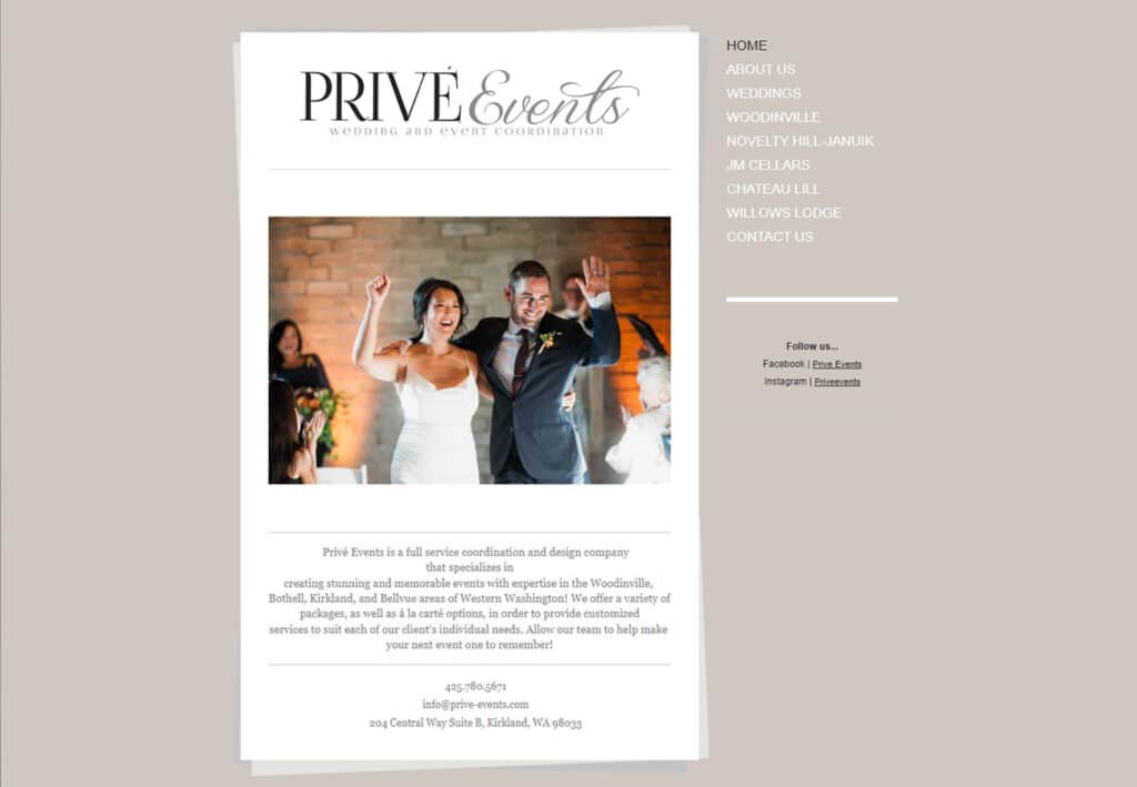
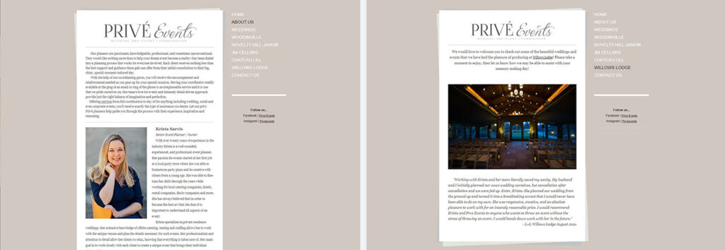
Have you ever sat down at a table with a glossy brochure or a crisp menu? Privé Events delivers that same sense of enticement with their simple, no scroll home page. We love the simple graphic turning the content box into a stack of pages, and the image carousel adds to the effect of flipping through a series of gorgeous offerings.
Free Custom Mockup
We deliver a free website mockup in 7 days. No future obligation or cost, guaranteed!
8: Quintana Events
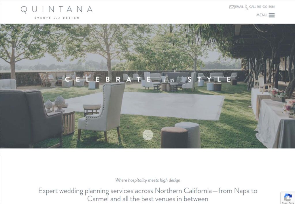
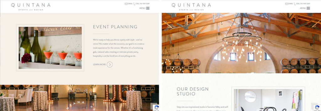
Traditional thinking in the field of web design holds that a good site design should minimize scrolling, with everything the user needs right in front of them. We’ve looked at some fantastic websites that completely turn that on its head, and Quintana Events takes that one step further with their use of parallax scrolling. Leaving one image in place with content blocks flowing over it gives the sense of peering through a window, and the cool colors contrast beautifully with the warm, inviting background images.
https://www.quintanaevents.com/
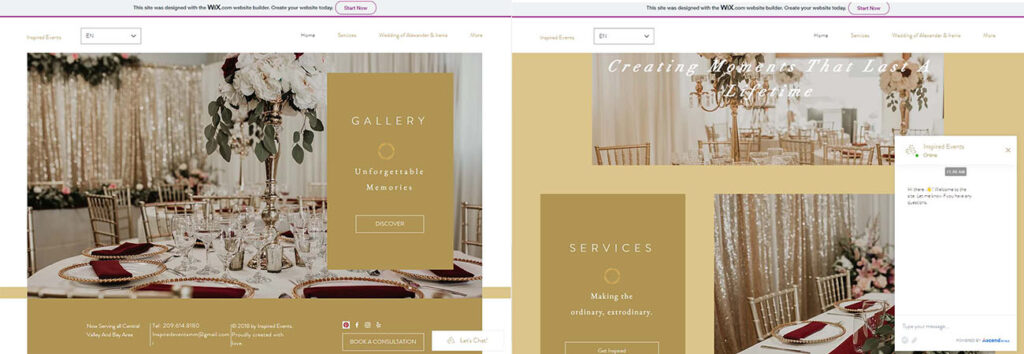
9: Inspired Events
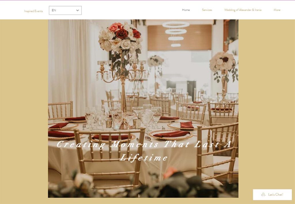
We love to see bi-lingual websites, and putting the language selector right into the header is a great way to highlight it without being overbearing. The colors are warm and intimate, and the chat box is a clever way to engage with customers without requiring them to fill out any forms or leave the page to send an email. One thoughtful design element that’s easy to overlook is leaving enough room on the right side of the page, including the footer, so that nothing is obscured by the chat field.
https://www.inspiredeventsmm.com/
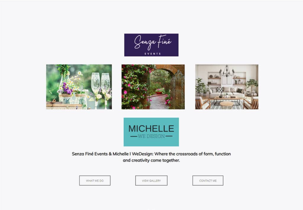
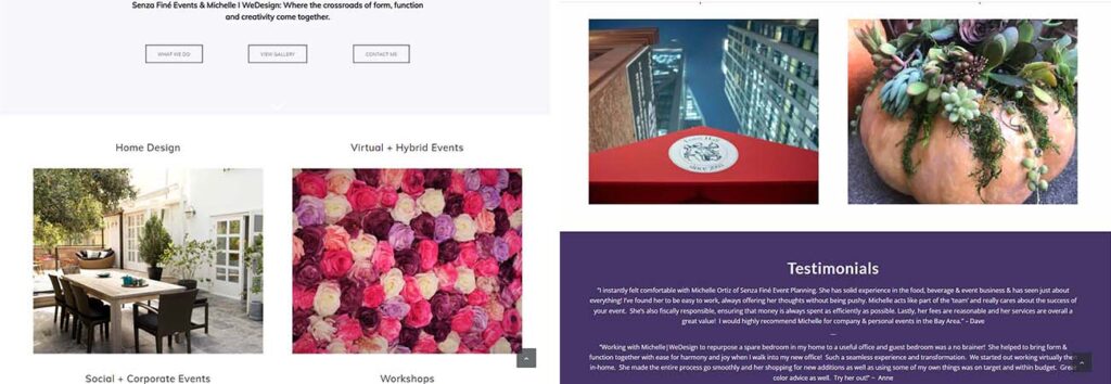
10: Senza Fine Events
Bridging the gap between a content-filled header and a full-page hero image, Senza Finé Events makes great use of content blocks and coordinating colors to give a sense of interest and whimsy to their home page. We love the shades of purple color scheme, and putting the contact us box directly under the testimonials is a great way to capitalize on your rave reviews.
http://www.senzafineevents.com/
