Websites dealing with finance need to strike a delicate balance: clean and slick enough to show that they’re professionals, but warm and inviting enough to foster a relationship between individual and company. They need enough information to show their financial chops, without bombarding the user with raw, hard-to-understand data. With all that in mind, let’s check out some great sites that make it all look effortless.
1: Personal Capital
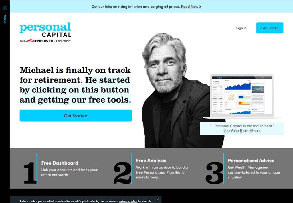
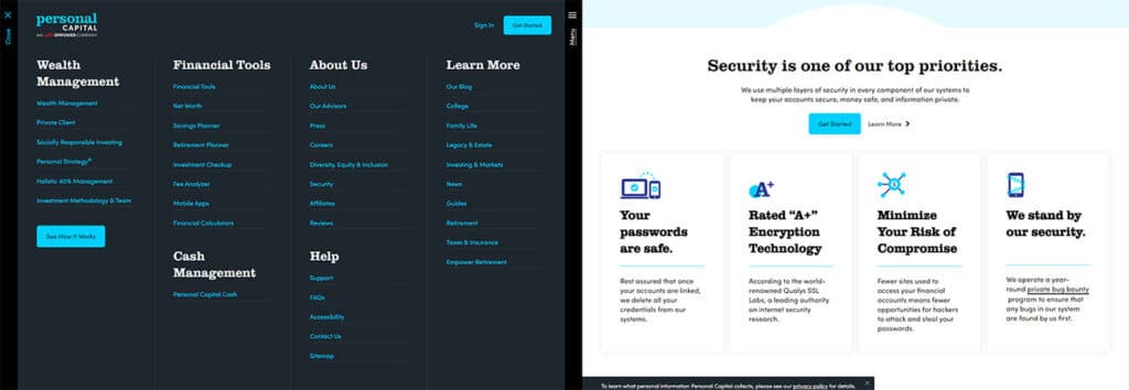
While some sites feel bright and empty, Personal Capital is bursting with well laid out content that feels professional but never overwhelming. We appreciate the minimalist sidebar that expands out into a full page site directory, as well as the links to highlighted blog articles in the header. Check out their retirement calculator, which is a medium-simple widget with a big impact, while bar graphs and charts easily convey the growth of wealth over time.
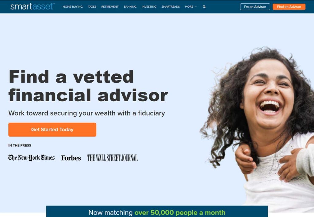
2: Smart Asset
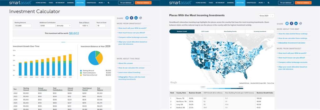
Smart Asset is a feature-rich site with a minimalist presentation style. The colors are soothing, with plenty of blank space for the eye to rest, but scroll down or navigate their wonderfully full header bar to find some really neat features. The investment calculator doesn’t shy away from data, with investment tables aplenty, and the interactive map of the US highlighting the areas of highest investment activity is unique and eye catching.
3: M1
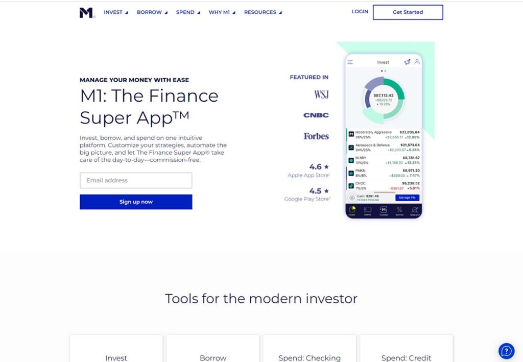
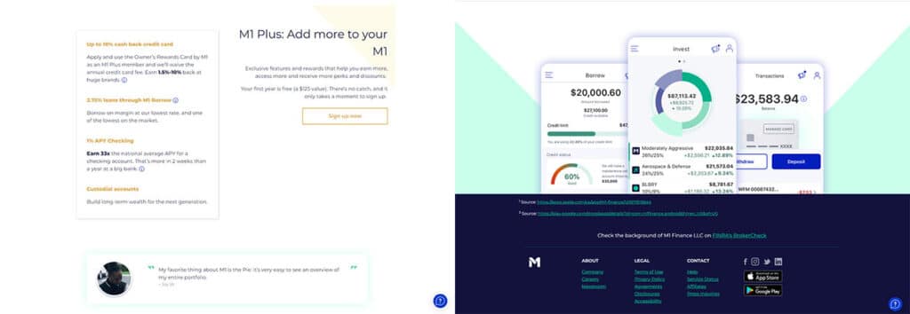
M1 offers loan management as well as investments, and knows exactly how to navigate the edge between investment and credit firms. Switching from the simple, bright and open content pages to the dark blue footer delineates the sections nicely, and the tasteful, colorful glows highlighting important content leads the eye without overwhelming them with content or graphics.
4: Betterment
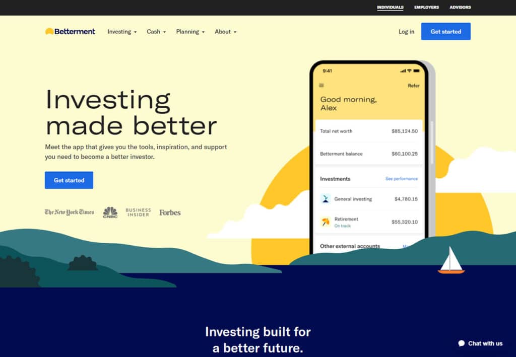
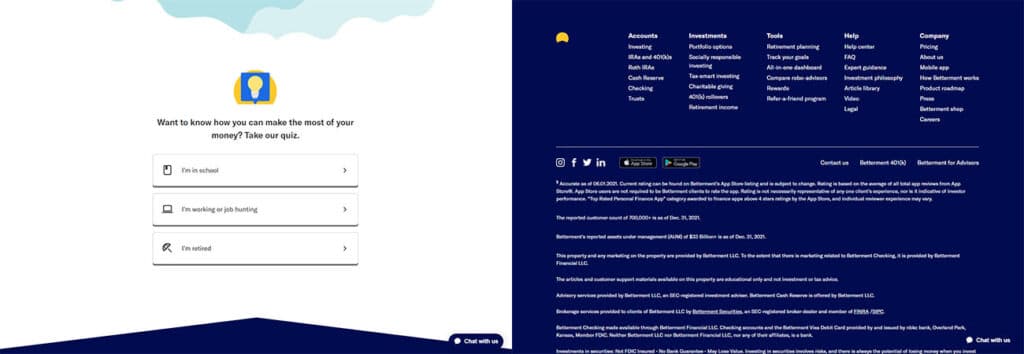
We love the bright, sunny color scheme that reminds us of waking up to a beautiful morning. The rising sun graphic with the investment app open in front of it gives a sense of how important it would be in the user’s daily life. Their footer and about us sections are merged, with tons of statistics provided. Quizzes are a good way to drive engagement. Includes their star ratings and other stats as selling points as graphics. Very simple vector graphics illustrations. Each menu section has different color themes. Overall gives the sense of “approachable”
Free Custom Mockup
We deliver a free website mockup in 7 days. No future obligation or cost, guaranteed!
5: Vanguard
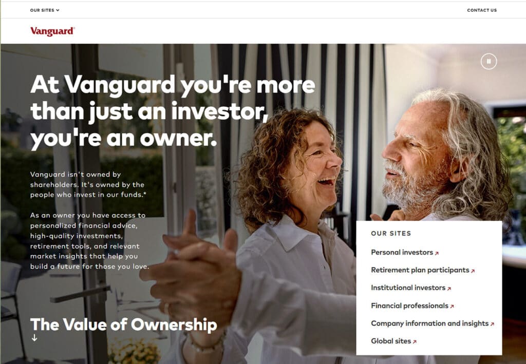
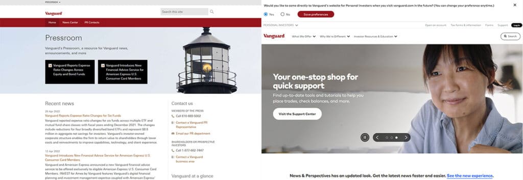
This site has a relatively short and simple homepage compared to other examples, and uses a full page hero image carousel of happy people and families to reinforce the connection between financial management and a better quality of life. Vanguard splits their site into multiple subdomains aimed at different demographics, such as retirees and financial professionals.
The idea of a press room featuring both publications and their own contact information is clever, as is the cookie setting allowing users to automatically redirect to the portion of the site applicable to them.
6: Harness Wealth
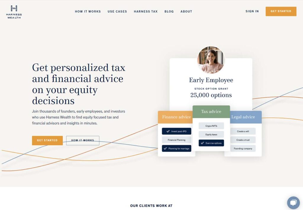
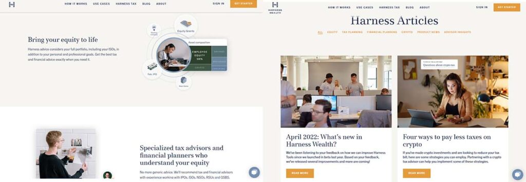
The chat box is ever present, good hero image, selling points have their own section (alternating white and gray backgrounds) book-ended by brands and business partners. Lots of contact information at the bottom, including direct email links in the footer (which is fairly rare) Advisor profiles are clean and informative. Their blog is clean, attractive and well laid out.
7: Farther
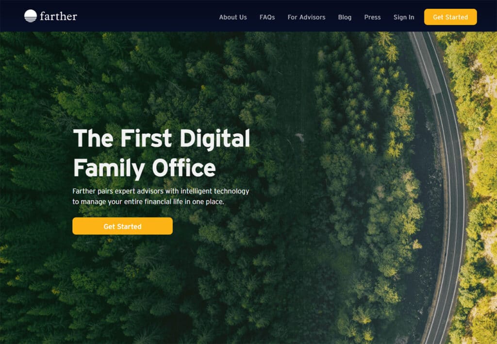
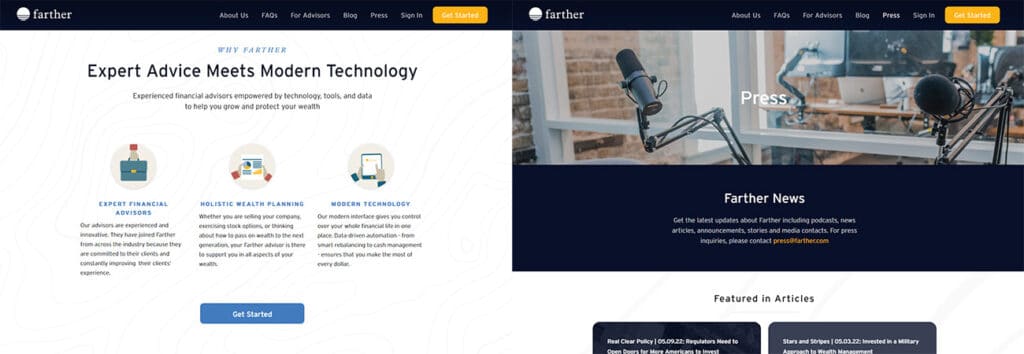
Gentle wood grain graphic breaks up large white spaces, balanced with smaller dark blue/gray images and sections. Large dark hero image lets the orange accents shine through like friendliness. Header bar stays with you as you scroll. Doesn’t overload the viewer with information, but does provide a simple FAQ. If you’re frequently featured in other publications, the Featured In section with its large, simple grid with the publisher, date of publication and topic in overlaying text is a smart way to go.
8: Blooom
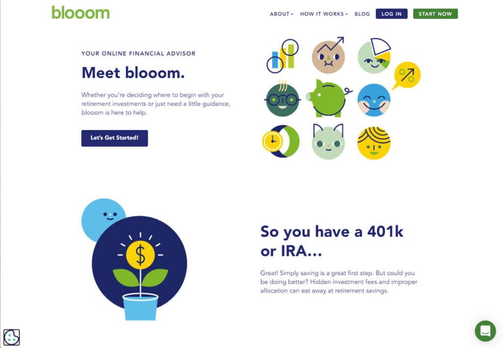
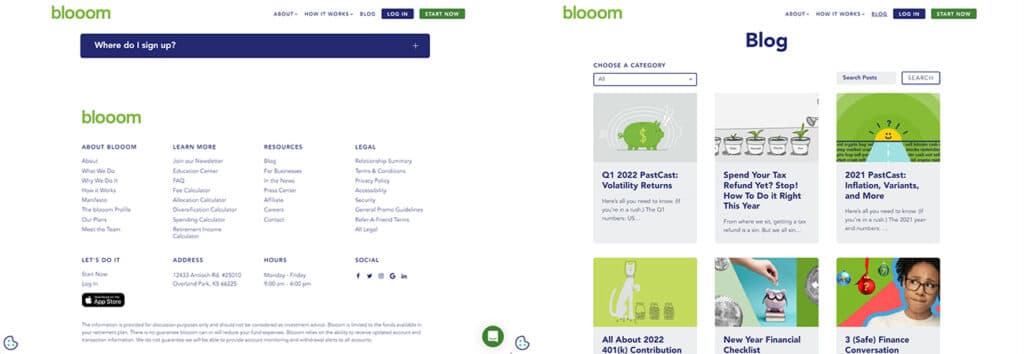
Bloom is very bright and friendly, almost childlike in its graphics and use of primary colors. Talking points and graphics are staggered, which gives a really nice flow to the medium-long homepage. Header menu is extremely pared down compared to other sites, giving a strong feeling about the experience of using the site without bogging the viewer down in details. Much of the info is still available, but is tucked discretely in a text link in the footer. The blog section is bright and busy, with a 3 column grid, category selector and dedicated search bar.
9: EMoney
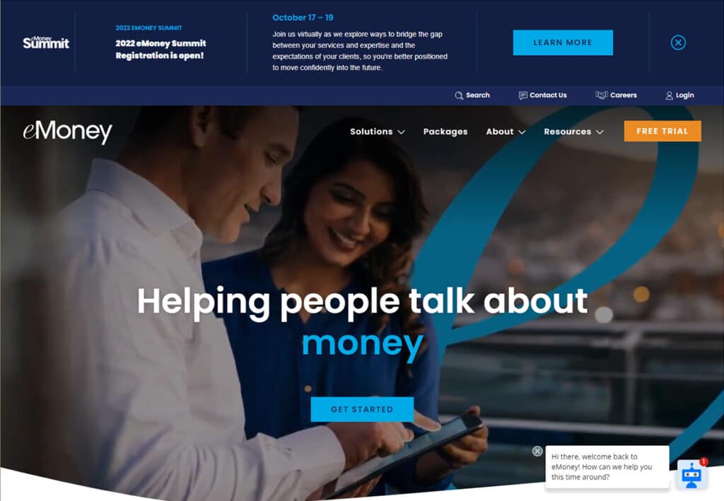
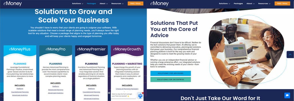
EMoney uses a dark blue and gray color scheme, and includes a summit banner at the top of the page (which is a great way to advertise widely without annoying popups), as well as an upcoming events bar within the footer. Has soft, asymmetrical curves in images and between content pages, the transition to sharp rectangles lower down gives a sense of moving into more professional/analytical data. The packages page does a great job laying out different plans side by side in a professional way, and the restrained use of animation in their graphics is a nice touch.
10: Ellevest
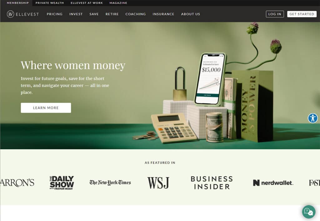
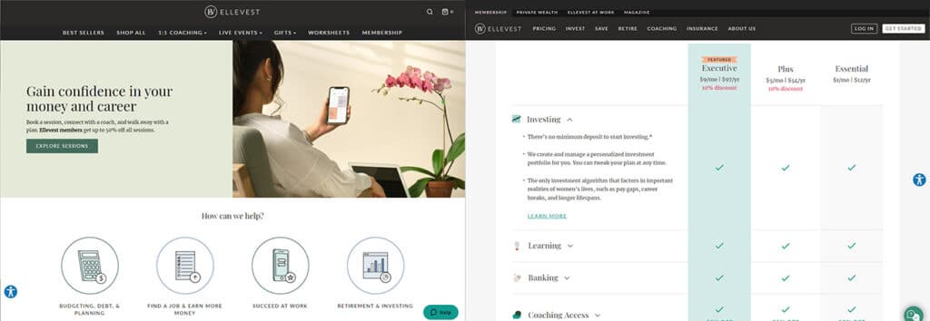
Ellevest is a company specifically focused on financial management for women, using a color scheme evocative of interior design or event planning. Restrained shades of green and gray, minimal graphics and a smoothly flowing animation bar with the logos of companies they’ve been featured in. The “explore digital investing” section is excellent, combining graphics with titles that expand out into descriptions without breaking the smooth look of the graphic. Overall, this looks like a glossy magazine, and we’re here for it.
