1: Alliance of Native SeedKeepers
“North America’s Leading Native American Led Seed Source”
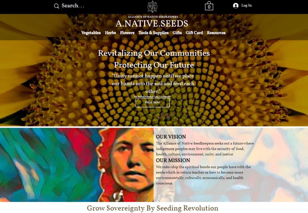
Bright, vibrant and dynamic, love the staggered panels reminiscent of brickwork. Packed with information and artwork, the design of this site just inspires you to get growing.
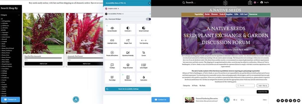
We are absolutely blown away at the level of care that was put into this website. Besides excellent additions to the storefront like forums, groups, and well-designed shop, the accessibility features are fantastic: All text is clearly visible against the images in the background. The accessibility icon featured at the bottom center of each page is remarkably rare and an incredible tool for anyone who needs to adjust the website for easier viewing. From screen contrast options to larger text and cursor, highlighting links, pausing animation and more, this site was designed with a lot of care.
https://www.allianceofnativeseedkeepers.com/
2: Botanical Interests
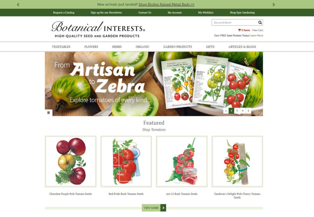
A classic seed and garden website layout, Botanical Interests keeps things fresh with a simple white background peppered with splashes of color from featured products, gardening tips, popular categories and more. Using vintage-style illustrations is surprisingly rare, with companies often opting for photos instead. This choice gives a dreamy, whimsical element to what might otherwise be a lovely but more generic example.
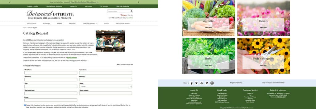
Using a catalog request form is a smart decision in the days of rising printing and shipping costs. Not only does it allow companies to save money by only shipping to people who have already expressed interest, it also acts as a great lead magnet for email subscribers.
https://www.botanicalinterests.com/
3: Baker Creek Heirloom Seeds
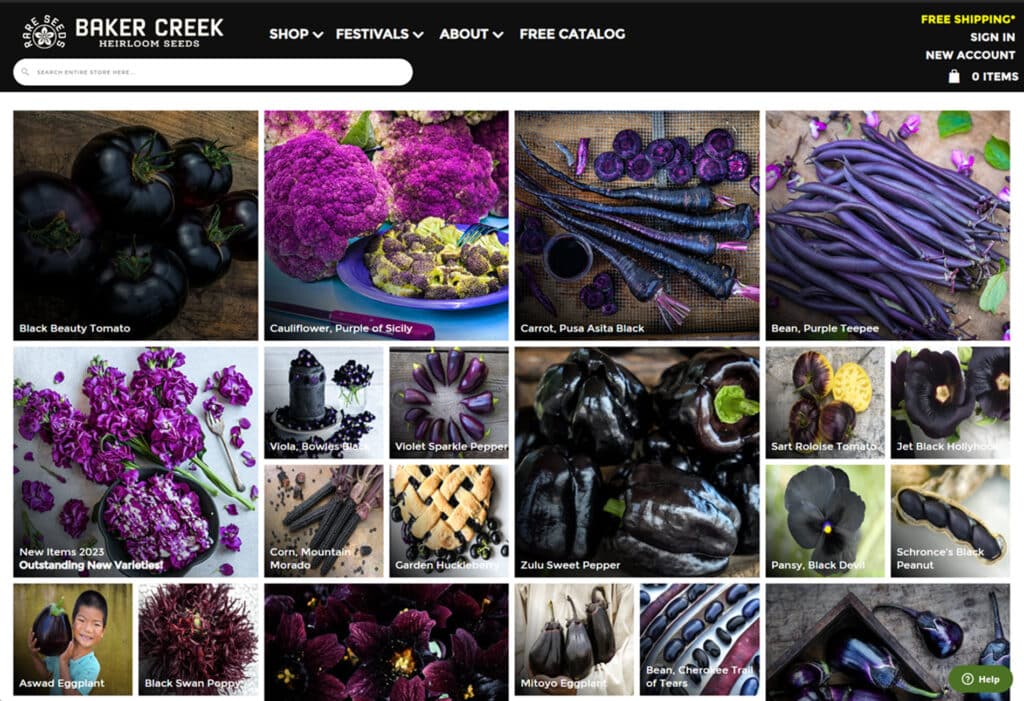
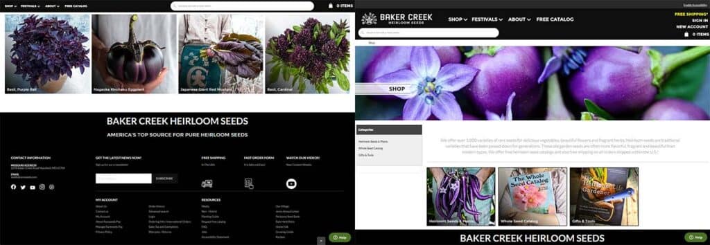
Beautiful website with a strong color palette. While using such image heavy designs has the potential to overwhelm the eye, we are loving the grids, which give the look of compartments full of beautiful and interesting things. Some product images are of the actual plant or blossom, while some are the tasty end product of the crops. The footer is discrete and informative, with a full site map, social media links and a perfectly-sized email address field for subscription.
https://www.rareseeds.com/
4: Annie’s Heirloom Seeds
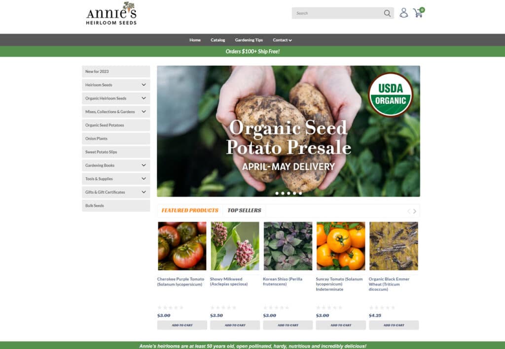
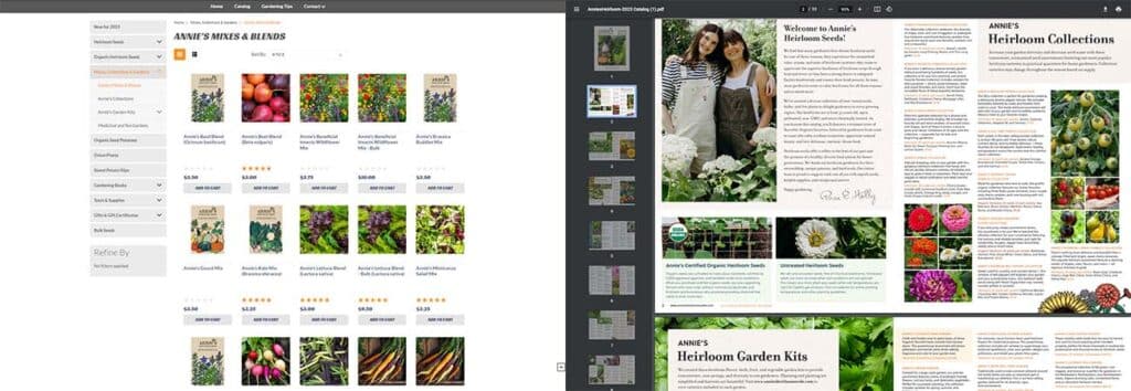
What a clean and crisp website! The featured products are discretely sized without minimizing the products, the hero slider is very nice, and providing gift certificates on the front page is a great way to capitalize on visitors who are impressed with the great product offerings but don’t garden themselves. While many sites charge for print-only versions of their catalog, Annie’s Heirloom Seeds also provides a beautiful and well-designed pdf document for in-depth seed browsing.
5: Magical Garden Seeds
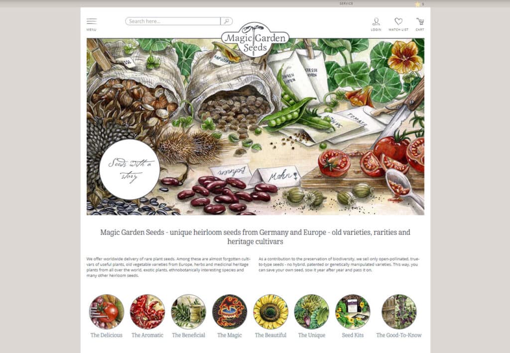
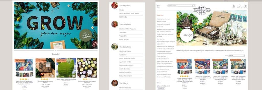
Providing fantastic seeds to those living in the UK: Magic Garden Seeds is genuinely, well, magical. Gorgeous site with storybook style art, and unique listings separating products into categories like “delicious”, “aromatic”, “magical”, etc. This often includes products you wouldn’t typically associate with those descriptors, and splits the grouping further into domestic, exotic and wild cultivars.
https://www.magicgardenseeds.com/
6: Migardener
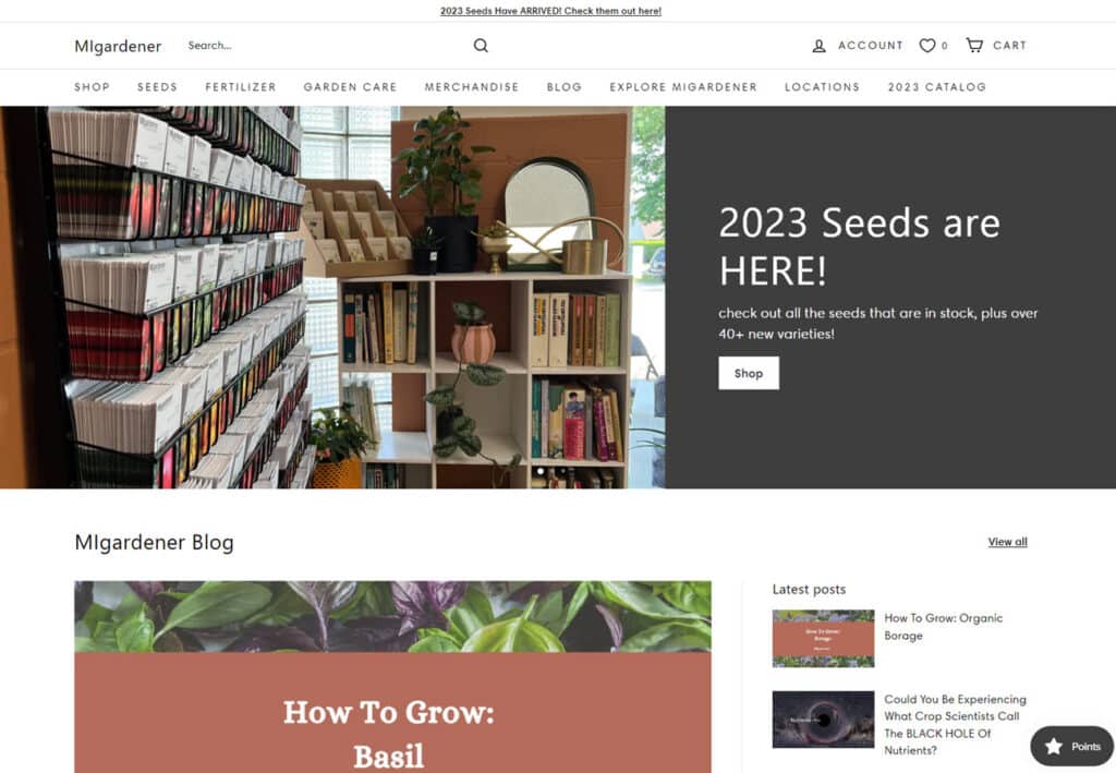
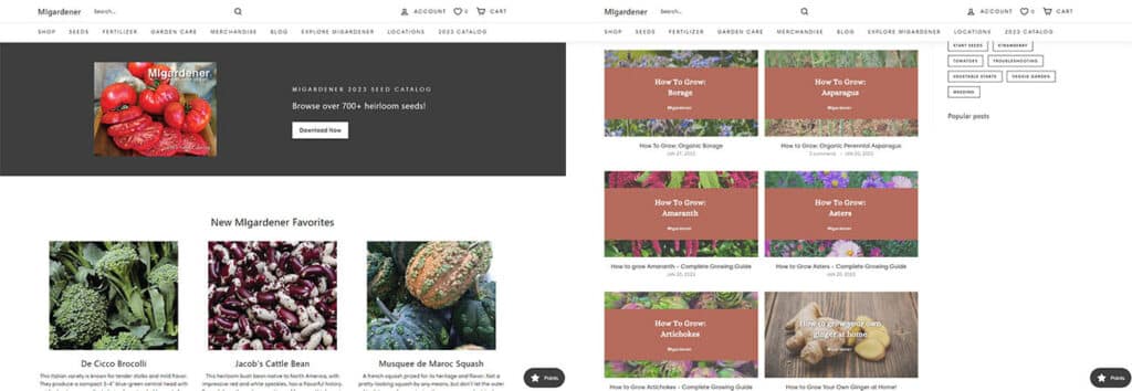
What a great example of well crafted simplicity. Tasteful colors and an excellent use of font and text sizing makes this site feel professional and inviting. Note the tasteful use of content blocks, and generously sized and spaced seed and product features.
Everything has a place, and never looks cramped or thrown in as an afterthought. Nice zooming/resizing of the hero images while leaving the text intact, which works so well because of the paired half-image and half-static color. As we can see here, if you do it right, the result is remarkably professional.
https://migardener.com/
7: Seed Savers Exchange
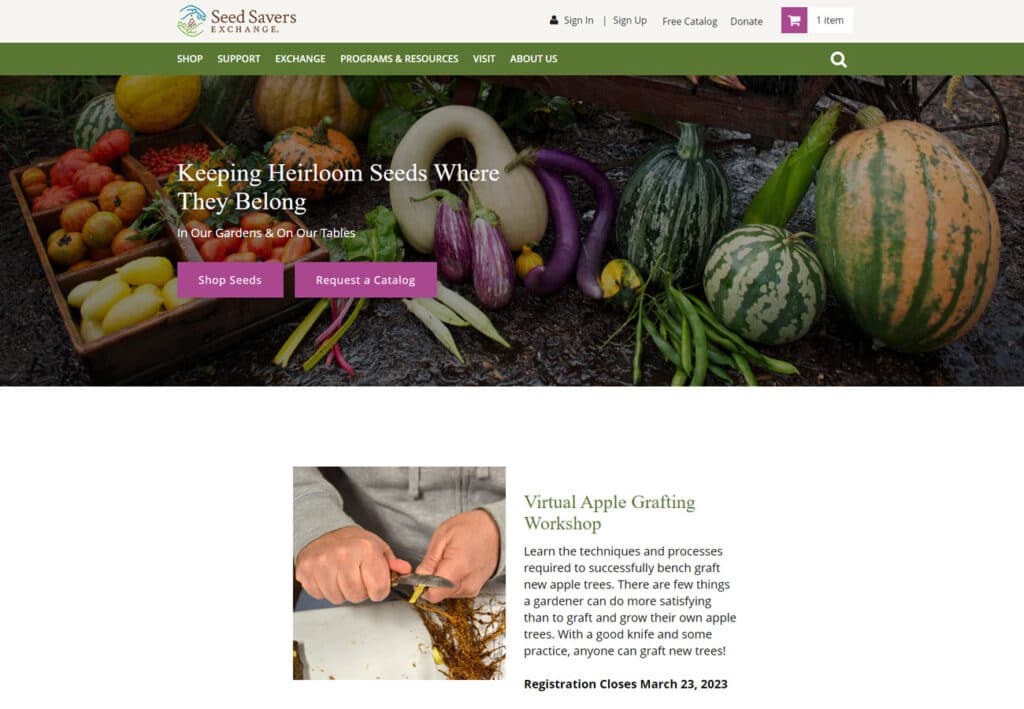
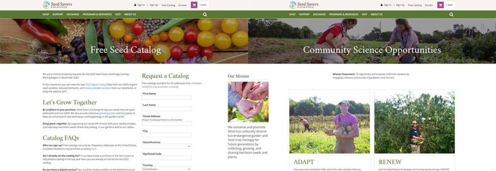
Seed Savers Exchange is of the great classic heirloom seed and conservation companies, and we’re obsessed for so many reasons. The site is crisp and clean, with nicely staggers product features, workshop features, text blocks and donation information. Check out the exchange portion of the site to browse hand-saved seeds from gardeners all over the country, and take note of the nifty profiles that bring to mind hundreds of micro-storefronts each supporting seed diversity.
8: Sow True Seeds
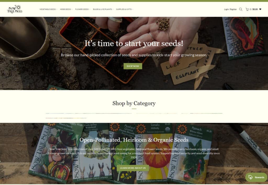
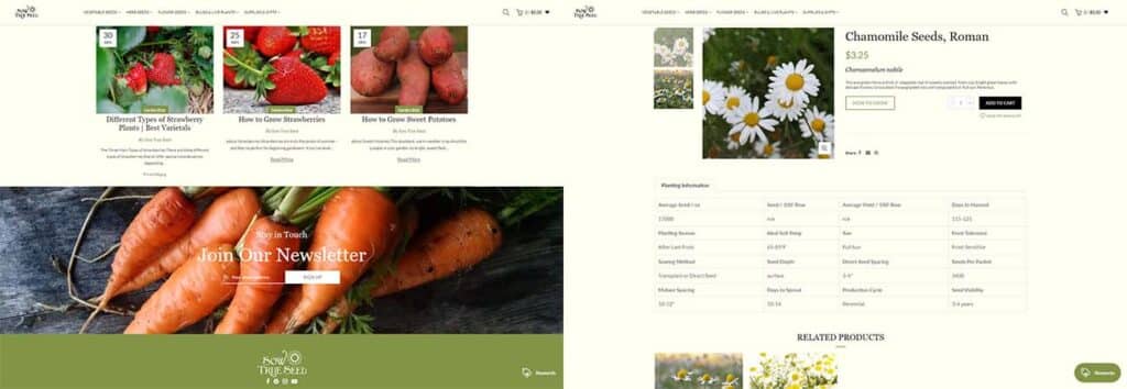
Soothing and warm, Sow True Seed uses a painterly image header, soothing cream and sage tones for the background, and an integrated garden blog with informative articles featured right on the homepage. The product pages are succinct and helpful, including detailed planting information, handy ‘how to grow’ buttons and a ‘notify me when available’ system for currently out-of-stock products.
https://sowtrueseed.com/
9: San Diego Seed Company
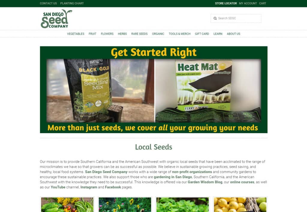
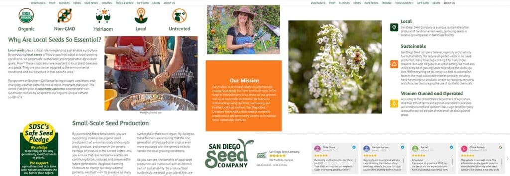
Using products and services as the hero image of the site is a bold and interesting move that gets right to the point. Another smart use of the ‘lead magnet’ concept, San Diego Seed Company offers a free winter gardening guide for anyone who subscribes to their mailing list. There’s a nice mix of fonts, colors and text sizes keeps things fresh, and we love the review slider on the front page. The ‘about us’ section is vibrant and well-designed, and the huge learning section serves to drive interest, excitement and confidence.
https://sandiegoseedcompany.com/
10: Heirloom Seed Vault
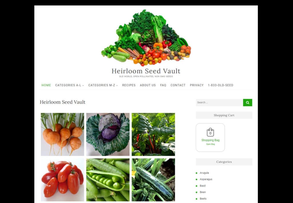
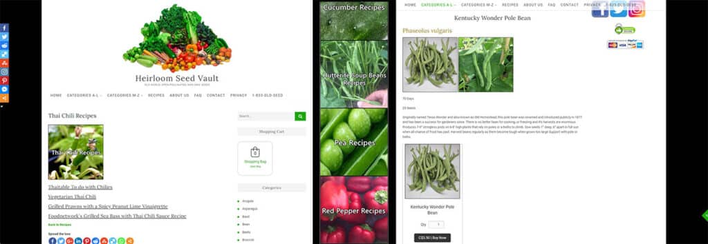
The Heirloom Seed Vault’s website is simple, clean and gets right to the point. One unusual but fantastic feature of this site is that the product descriptions and purchase options are right on the product listing, which makes it easier to make impulse additions to the shopping cart as you browse. Putting the shopping cart and user information on the right hand side of the screen is also unexpected but effective, using the unusual placing to make it stand out more and suit the flow of the page content.
https://heirloomseedvault.com/