We’re excited to show you our top picks for restaurants with excellent web design, which balance drool-worthy photography with clear menu styling and easy-to-find ordering information. We think you will find yourself craving something yummy for your next meal after browsing this list. Let’s dig in!
1: The Stockpot Broiler
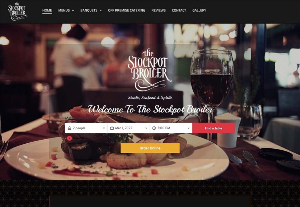
The warm tones and intimate setting of the hero image lends a lot to this site, perfectly matching the steak and fine spirits offered in The Stockpot Broiler’s menu. We love how the white cursive and multiple font sizes balance the open table integration, allowing the users to easily set up in person or takeout dining without disrupting the overall presentation of the home page.
https://www.stockpotbroiler.com

2: Stanford’s
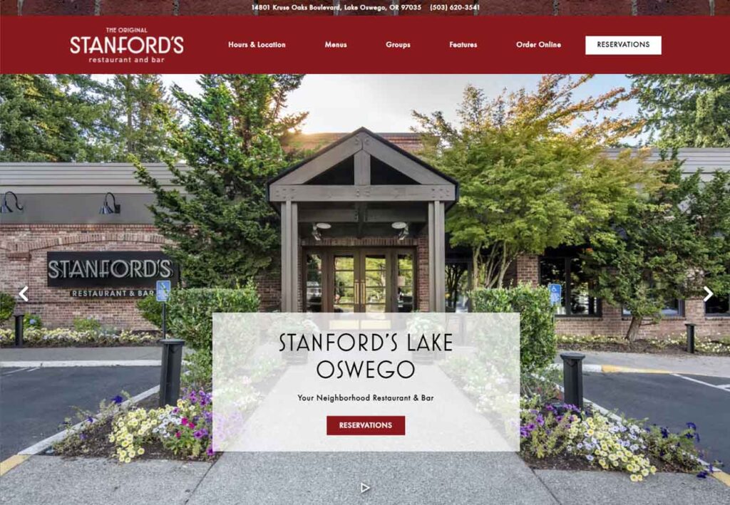
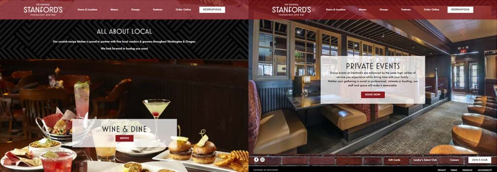
We love the balance of full-page images and understated textures on Stanford’s home page. The image carousel features a nice balance of front and back of the house, giving the sense of almost peeking behind the curtain at the delicious food being made, and the care taken to change font colors means that the text is fully readable over a gorgeous variety of bright and dark images.
https://www.stanfordsrestaurant.com/
3: Thai Delicious
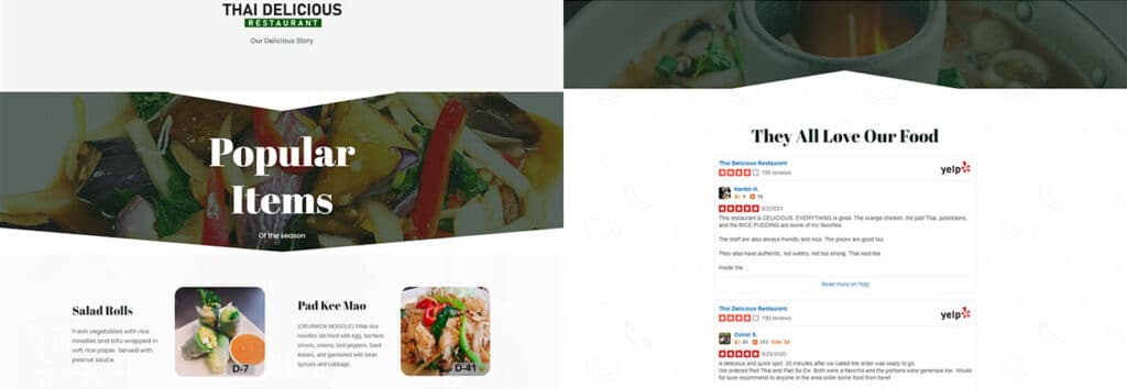
We’re suckers for great food photography and Thai Delicious does an amazing job highlighting their mouthwatering Thai food in both the hero image and smart, paired-down popular items menu. The use of triangular white space within the images breaks up the standard grid blocks seen on nearly every site and gives a great sense of motion towards what really matters: the food.
https://thaidelicioustigard.com/

4: Ritter’s Eatery
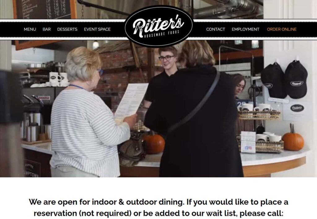
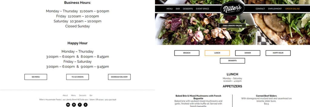
Ritter’s Eatery is an example of minimalism done really well. Featuring a header bar that calls back to classic diner imagery and simple white pages with black font, every element has a purpose. The menus are clean and easy to access and all the important details, from hours to location, are displayed prominently to help customers get in the door and start ordering as soon as possible.
https://www.ritterseatery.com/
Free Custom Mockup
We deliver a free website mockup in 7 days. No future obligation or cost, guaranteed!
5: Archive Coffee & Bar
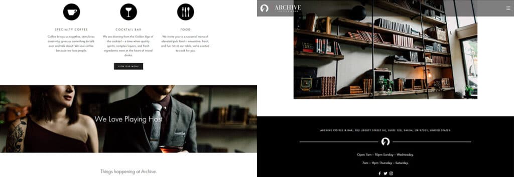
If we’ve looked at examples of both richly atmospheric and clean-and-simple design, Archive Coffee & Bar does a great job of bridging the gap. The custom, minimalist icons separating the coffee, cocktail bar, and food menus are clear and concise, and the variation in image size and layout allows bright pops of color without overloading the eye.
https://www.archivecoffeeandbar.com/

6: Isaac’s Downtown
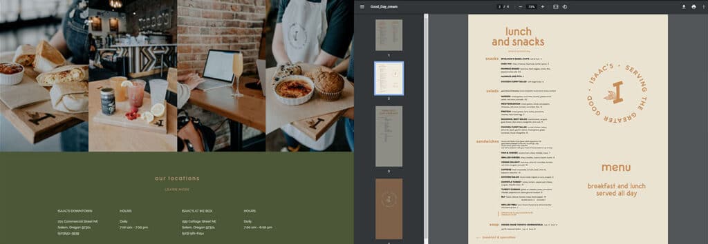
The more you look at Isaac’s Downtown web page, the more the little details start to pop out. From the warm earthy color palette that’s consistent throughout all the pages to the understated font and warm cream content sections, this site does a great job of creating an atmosphere before you even walk in the door.
https://www.isaacsdowntown.com/

7: Hayden’s Lakefront Grill
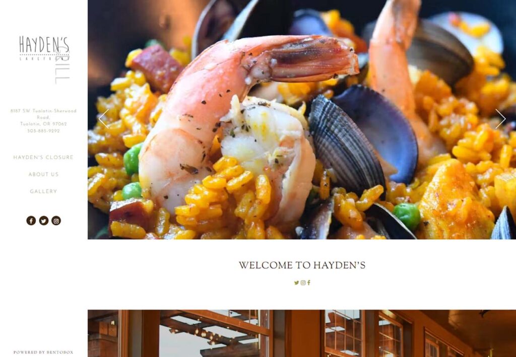
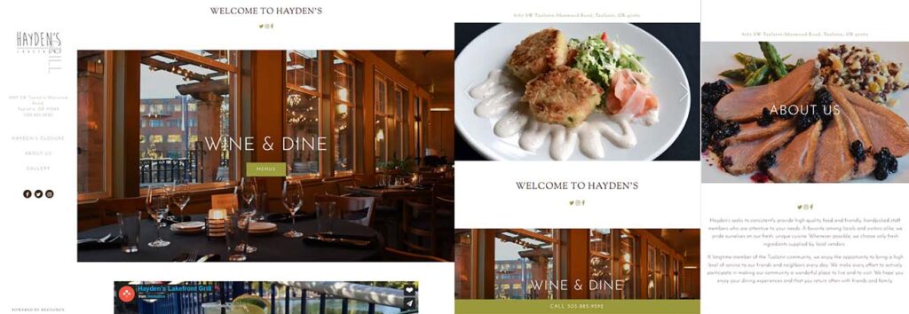
With the ubiquity of smartphones and online ordering, having a reactive website that works at multiple browser sizes is a must. Placing the content bar at the side of the page rather than as a header allows it to shift seamlessly on mobile devices, and the menu redesign on smaller devices makes Hayden’s food look (if possible) even more appetizing.
8: The Tavern
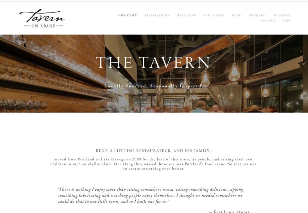
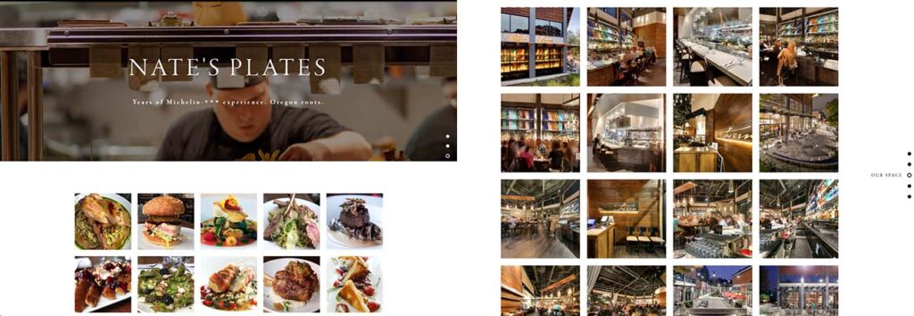
The owners of The Tavern obviously have a lot to be proud of, and smart design choices really let that shine. With expansive thumbnail blocks full of stunning, high-quality images, we were almost too busy drooling at first to appreciate the crisp menu pages and unique vertical carousel navigation.
9: Carlton & Coast
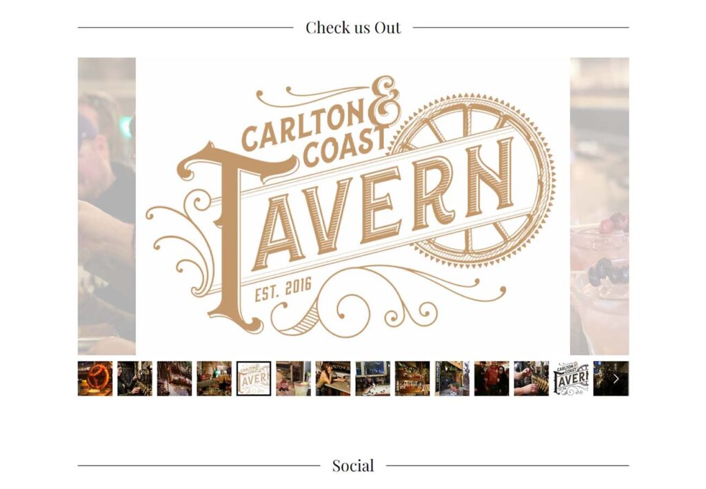
It’s always hard to convey something as visceral as flavor or atmosphere on a 2-dimensional webpage, but Carlton & Coast has some great features that really bring the restaurant to your screen. We love the expansive carousel menu, including lower opacity crops of the previous and next items on the slider, and the circular images and 3 column layout of their About Us section balance the amount of content available beautifully.

10: Wild Fin American Grill
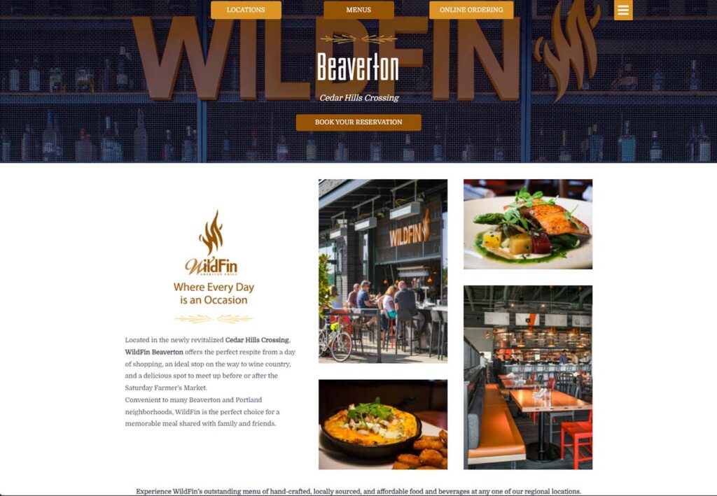
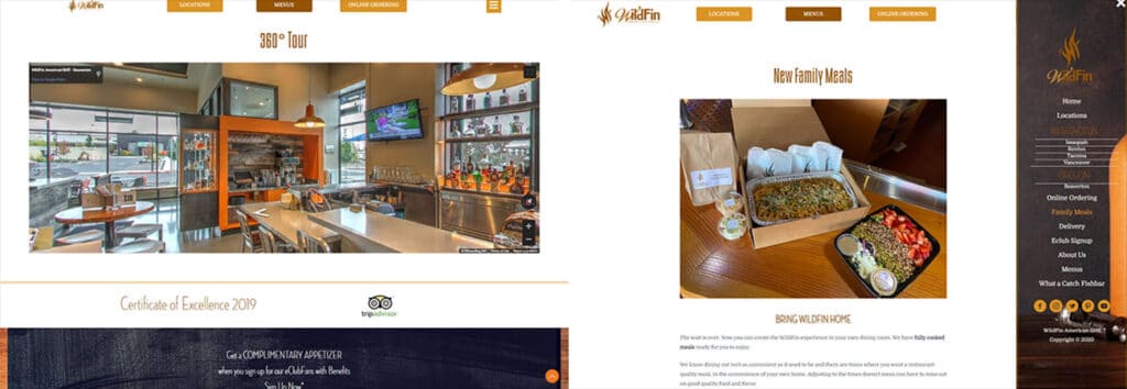
We love the dynamic color palette of this site. Along with simple buttons and an engaging layout, we’re also impressed by Wild Fin’s neat image thumbnails that switch from full color to black and white on hover, and the 360-degree restaurant tour, complete with scroll and movement from area to area.
https://www.wildfinamericangrill.com/beaverton/
