Whether your target audience is looking for work personally or hoping to score a great employee, there’s lots to think about when developing a great staffing or recruiting website. From slick graphics to a good call to action, plus plenty of data displayed in helpful and intuitive ways, let’s dive into our favorite sites.
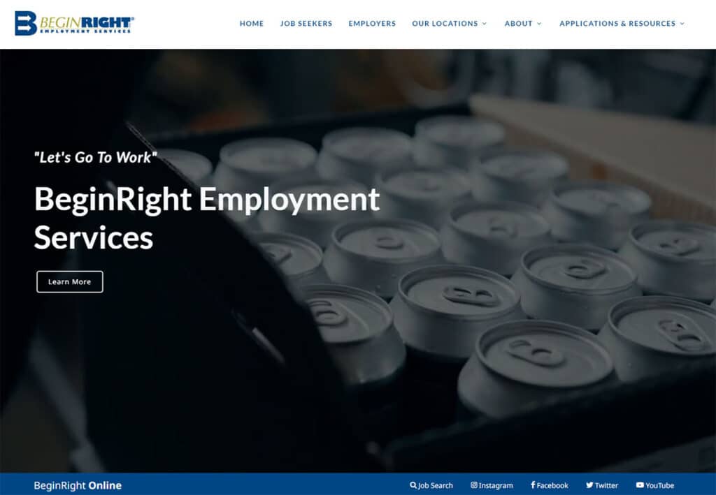
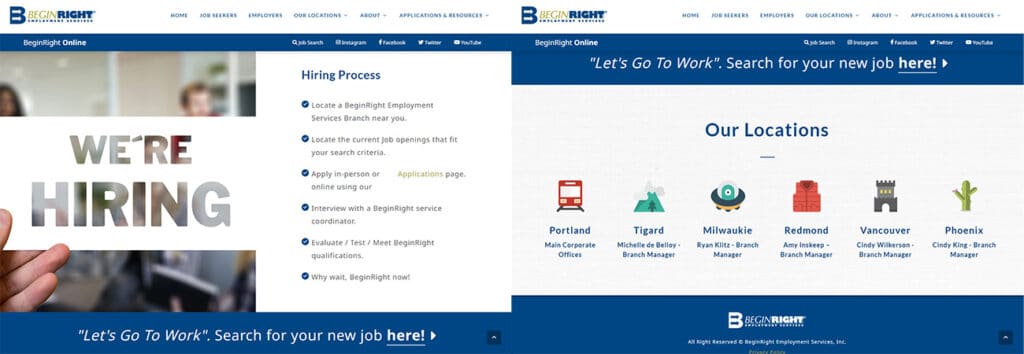
1: Begin Right Employment Services
Calls to action are excellent in any marketing medium, and the tagline “let’s get to work” sets the tone for this website right off the bat. The steps of the hiring process are clearly laid out, and the popup animations, banners that light up on hover and the cute vector images help make this site friendly and approachable.
2: Atrium
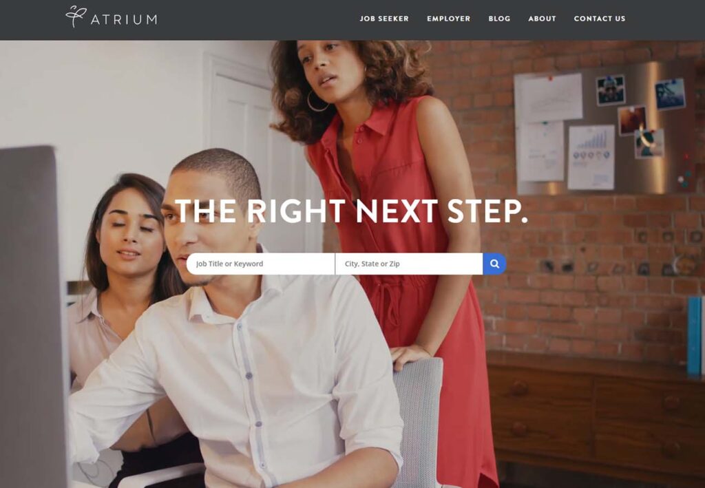
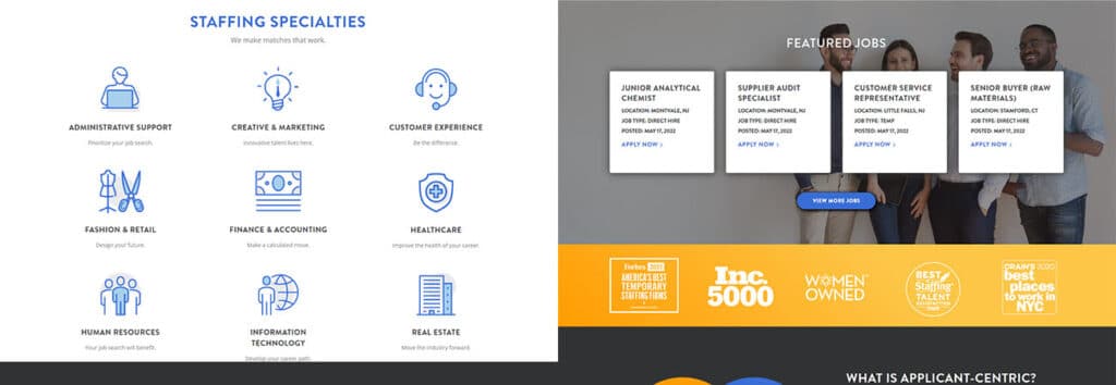
Atrium uses a simple dropdown menu system for both Employers and Job Seekers, which also includes a blog, “about us”, and “contact us” sections. Their use of animation tells a good story, and their header “The Right Next Step” draws attention to their search bars, where users can sort by title, keyword, or location.
https://www.atriumstaff.com/
3: AppleOne
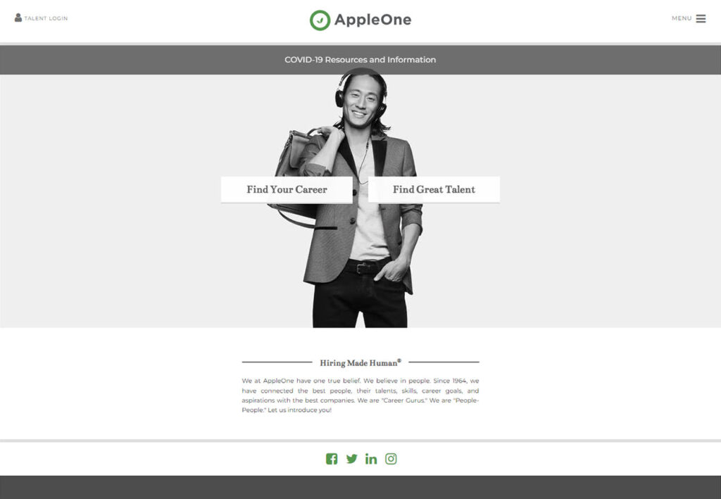
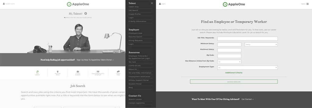
Easy, professional and minimalist. Everything is separated between “Find Your Career” and “Find Great Talent” buttons right on the front page, or navigate directly to the discrete sidebar menu to find a full menu of services and resources. All menu items are expandable, everything is broken up into easy to digest sections, and pops of color from sections that light up on hover add touches of visual interest. Bonus points: workers rights documentation as an easily accessible menu item, which we love to see.
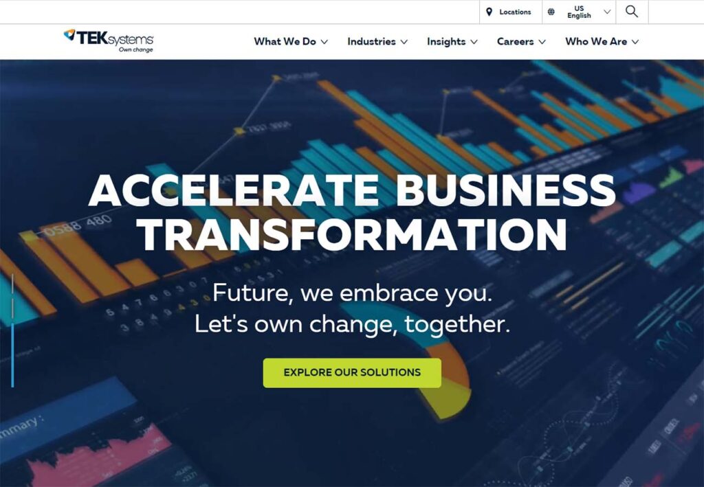
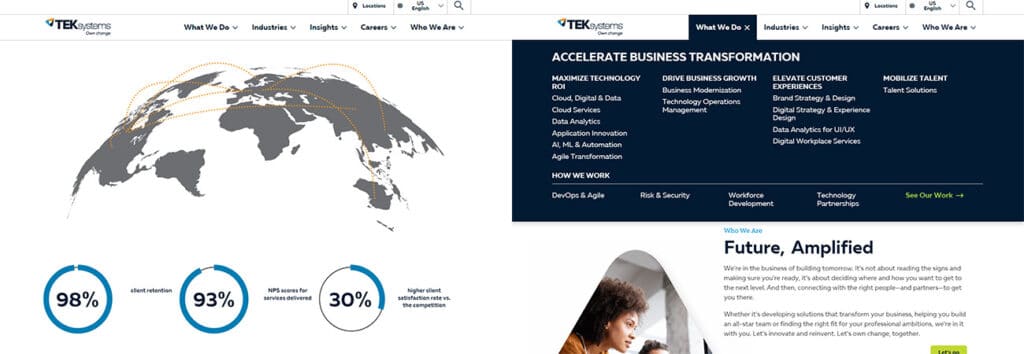
4: TEKSystems
Media heavy and chock full of blog posts, infographics, podcasts, and more, TEKSystems uses a bold header to grab your attention immediately. The three short animations in the full page hero all work together to tell the story of technology, science and industry moving toward the future, and the drop down menu at the top of the page provides ample options and a brief “who we are” section. The asymmetrical image cutouts leave plenty of whitespace to rest the eye on, and the graphics used to display their bragging points are slick and compelling. It’s always nice to see site policies and codes of conduct in an easily accessible way.
5: Adecco
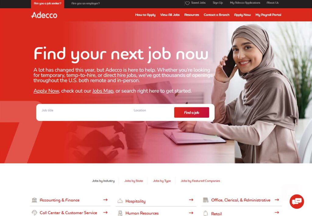
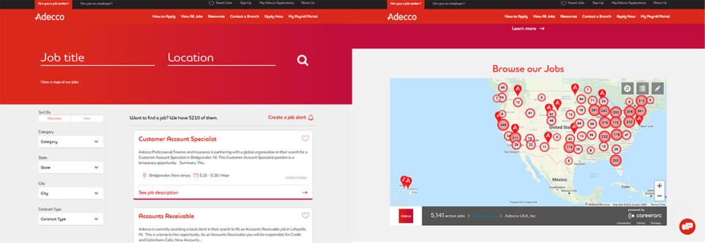
With bright, vivid colors, Adecco doesn’t shy away from content. Front-loading most of the recruitment information right on the front page allows them to spring for niftier features down below, including a great job searches map, and the saved jobs button right on the header menu is a great feature. Prominent display space for awards and certifications. We love that users can browse jobs by category without signing up for anything. This site is the opposite of minimal, but beautifully engaging and human.
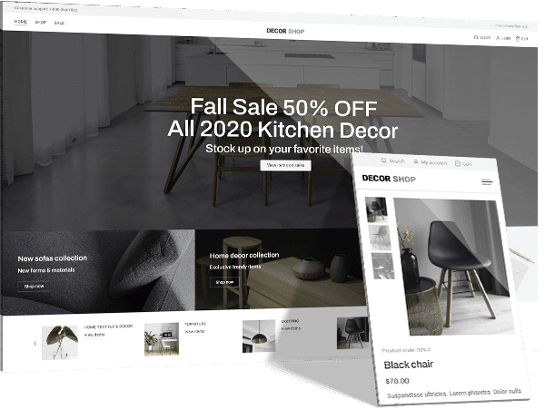
Free Custom Mockup
We deliver a free website mockup in 7 days. No future obligation or cost, guaranteed!
6: Manpower Group
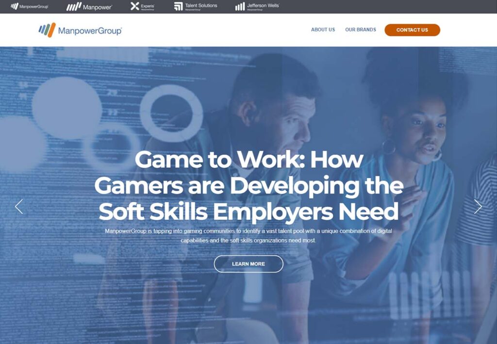
Manpower group makes great use Multiple use of the big hero carousel, including survey data, resources and other educational material. Child sites are cleanly presented above the menu bar. Their statistics are front and center below the hero image, highlighted in large font with a minimalist design in the background. Their suite of workplace solutions is clean, well presented, and the staggered full and open content blocks eases the eye. Nice “recognition” carousel, and easy to access contact information.
https://www.manpowergroupusa.com/
7: NW Staffing Resources
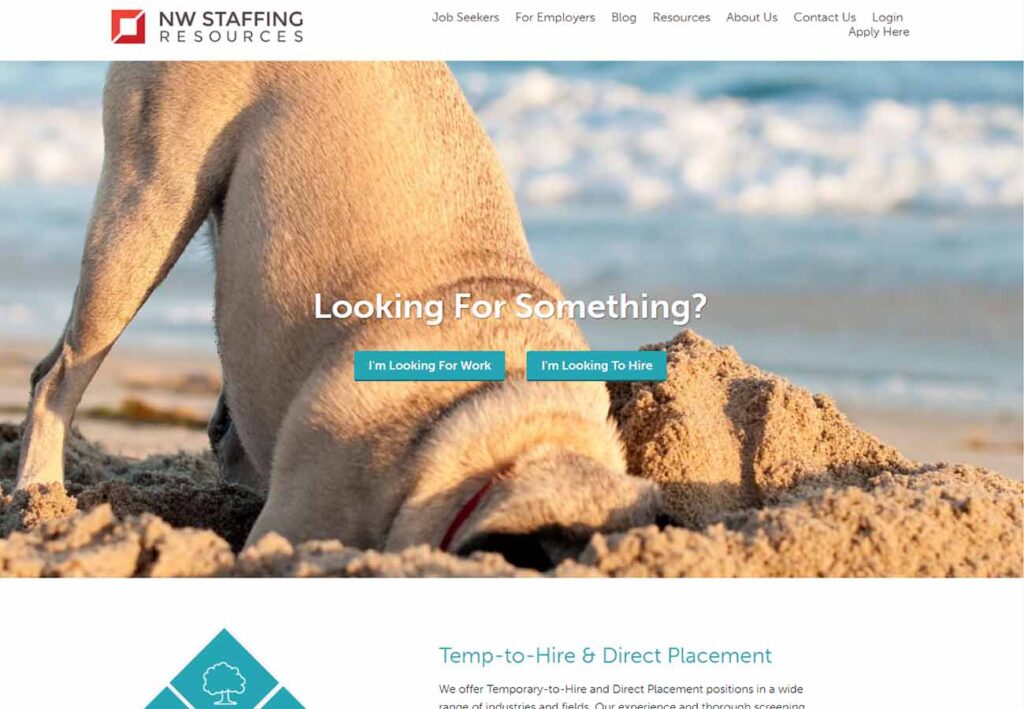
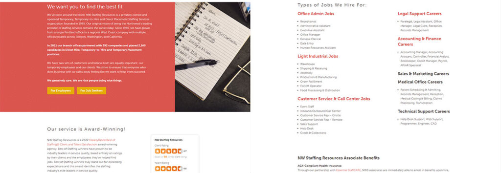
Uncomplicated, separate sections are clean and easy to read, and the images never overpower the page. Split into Looking for Work and Looking to Hire sections on the hero, NW Staffing Resources gives a broad range of employment options. Sections have a great use of color, and every section is clearly delineated while maintaining cohesion. Very open about the types of work and benefits available, check out how their awards and certifications section is combined a well thought out pitch.
8: Randstad
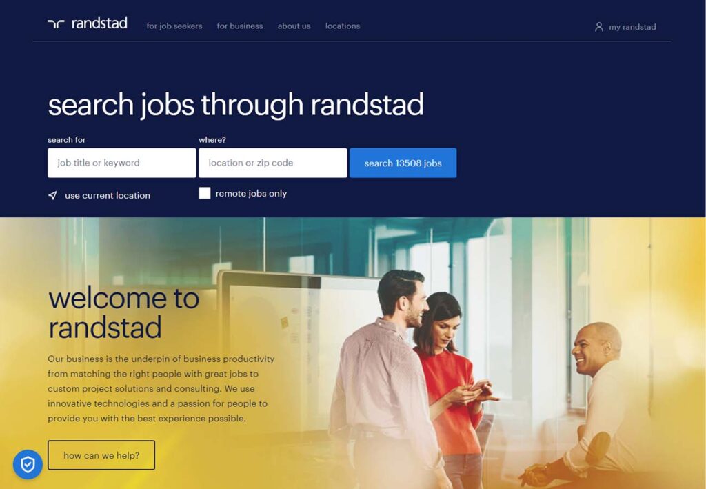
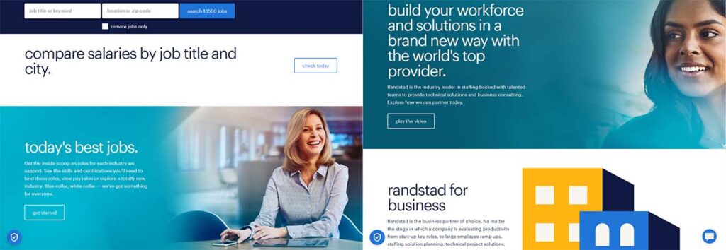
Very prominent search bar combines a good design trick, reinforcing user engagement with a call to action. We love the warm amber glow combined with the dark blue base color. An elaborate footer provides career and employment resources with blog articles, business insights, career advice and all company policies and agreements. Overall a beautiful site that incorporates excellent design, but always in service of functionality.
9: Korn Ferry
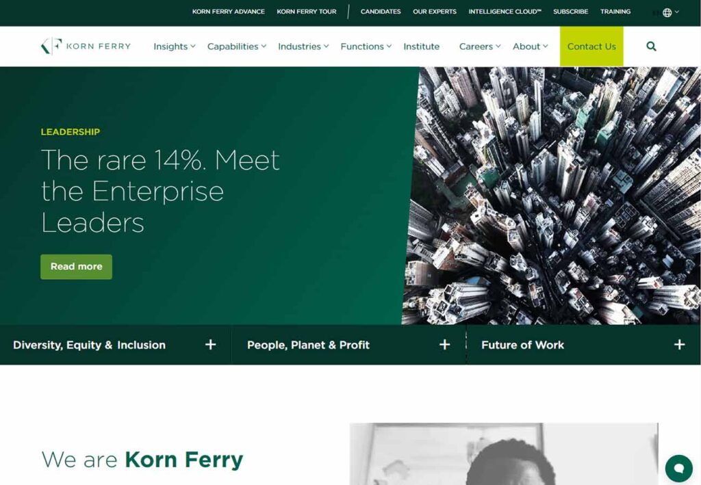
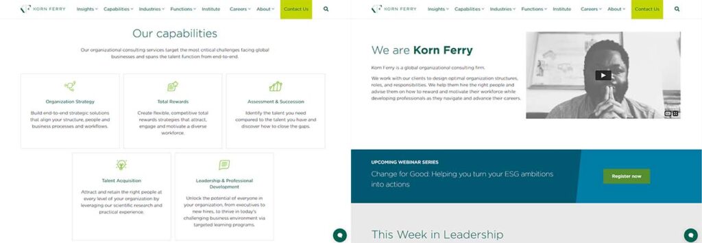
Korn Ferry offers up crisp colors reminiscent of money and finance with a great design. The hero text talks about leadership, and the pop-out menu below is divided into social issues and how the company as a whole is handling them. Focussing less on the specific jobs available and more on the benefits of choosing Korn Ferry specifically, the presentation is clean, crisp and competent.
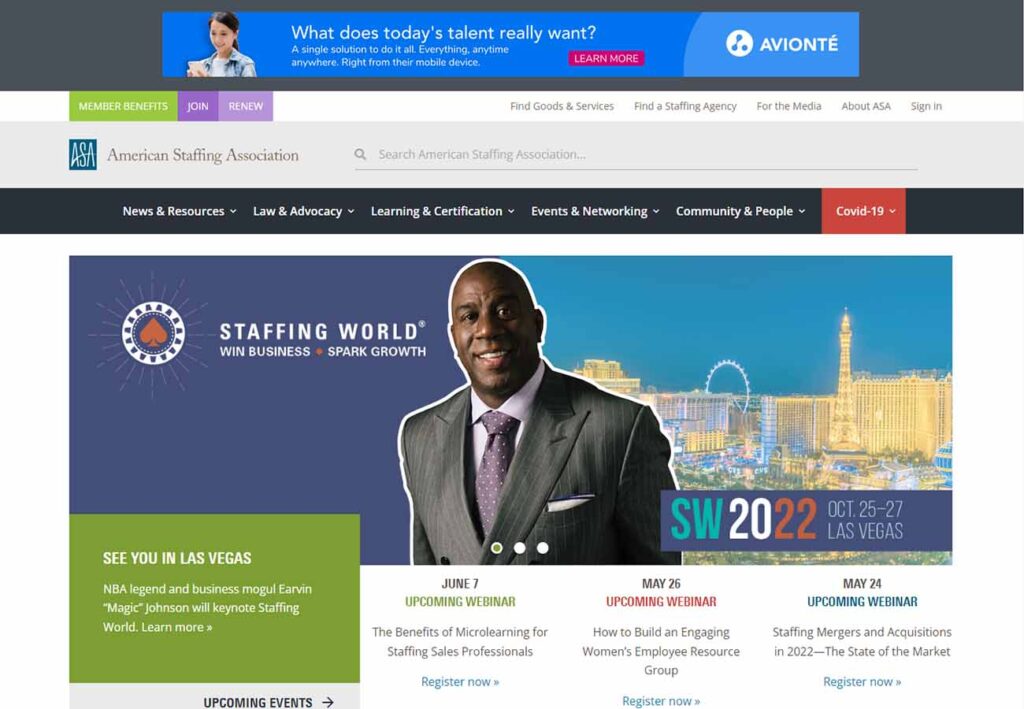
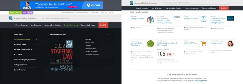
10: American Staffing Association
American Staffing Association reminds us of a friendly and informative bulletin board. We love the calendar of events, and not just visually or for the information it provides. Having posts on the front page with current dates helps show viewers that the site is active and involved with new leads and presentations. Love the featured resources. Because the header bar pops out into a full-page menu, the included graphics help to break up some of the dark background while still feeling immersive.
